Help Me Pick My Author Photo
April 4th, 2009 at 8:45 pm by --KALEB NATION--
Whilst wrapping up 11 solid hours of final copyediting today (and I’m still not done!), I received an email from the great and gloriously talented Amy Howe. Amy is a photographer from Dallas, TX, and she did the photo shoot for my author photos last week. After ridiculously strong winds and many laughs (partially thanks to Kallie Matthews of Twilight Series Theories), here are the results:
- 301
- 30b1
- 311
- 31b1
- 331
- 33b1
- 551
- 55b1
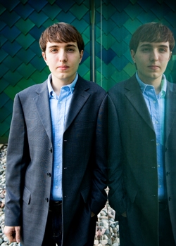
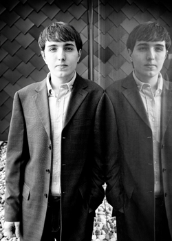
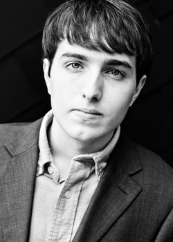
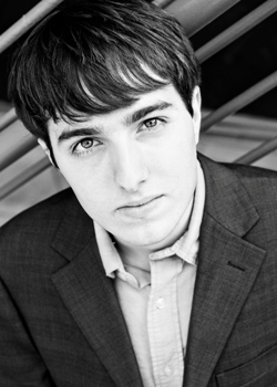
CLICK TO SEE LARGER. The photos on the right are exactly the same as those on the left, but B&W.
One of these photos will appear in the book as my author photo, and will be used in all promotion for the book. Which photo do you think would work best as an author photo? Tell me in the comments!
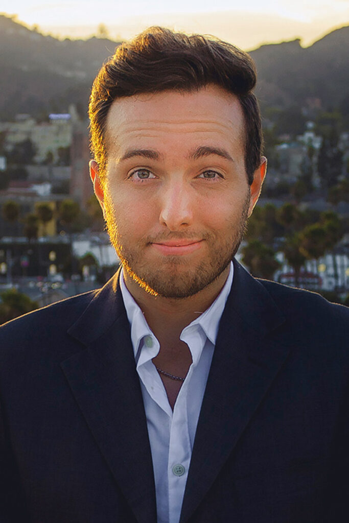
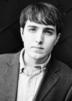
Speaking of author photos, here are some of my favorites from other writers:
- JK Rowling
- Stephenie Meyer
- Simon Vanbooy
Posted in About Me, Bran Hambric, Photos
Tags: Author Photos, Photos


April 4th, 2009 at 8:49 pm
I like # 551. Very professional :]
April 4th, 2009 at 8:50 pm
I like 331.
April 4th, 2009 at 8:50 pm
Hmm…
I say
301, 551 and 55b1
Hopefully I helped, and those photos are awesome
Kitty
xzx
April 4th, 2009 at 8:51 pm
I vote for 551. It like really brings out your eyes and looks epic awesome.
April 4th, 2009 at 8:51 pm
i like 331 it makes your eyes look really blue! very awesome!!!
<3 Josie
April 4th, 2009 at 8:53 pm
Use 551. I like the lines in the background thatgo in the oppoiste angle than you.
April 4th, 2009 at 8:53 pm
Gah.
Too hard x_x They all look so /nice/.
My favorites are 551 (fourth one down in color) and and 331 (third one down in color.) But the one I choose is 551.
-Fruit
April 4th, 2009 at 8:53 pm
I was going to say 33b1, but I’ve changed my mind. Go with 55b1.
April 4th, 2009 at 8:54 pm
Hmm…
They all be great
But Im liking the 301 one
XD
April 4th, 2009 at 8:54 pm
I really like 301 and 55b1
these pics are amazing kaleb!
April 4th, 2009 at 8:54 pm
All of them are cool, but I like 301 & 551 the best!
April 4th, 2009 at 8:55 pm
I really like 331 and 551. Love the blues and colors. Good luck choosing…cause they’re all pretty great!
April 4th, 2009 at 8:55 pm
Though I like 301 a lot, I think 55b1 would make a better author photo. js.
You look very handsome, by the way.
April 4th, 2009 at 8:56 pm
55b1
April 4th, 2009 at 8:56 pm
301 or 55b1
April 4th, 2009 at 8:56 pm
i like 30b1 and 55b1 i couldn’t choose!
but def. B&W ^.^
April 4th, 2009 at 8:57 pm
oohh!!! i really like 55b1 and 33b1… but i have a thing for B&W….. lol… i like the color versions of those two as well =]… so i think my actual overall favorite is 551? lol
April 4th, 2009 at 8:57 pm
I like 551. It really brings out your epic eyes.
Honestly, I love all the pics; they’re amazing. 551 is my favorite, though.
I can’t wait til Bran Hambric comes out.
—————-> <3 Veggie(:
April 4th, 2009 at 8:58 pm
Thought, perhaps 551….Hm, the coloring is nice, good contrast with the red. No, no, I still say 55b1.
April 4th, 2009 at 8:59 pm
May I suggest 551. But, how about adding a black and white BG, and you stay in full color. I mean that would not only take you out of the stereotypical author photos. But make the BG, much more interesting. it’s already very much interesting, talk to your photographer, I’m sure she can come up with a better All tough idea.
April 4th, 2009 at 9:00 pm
55b1 fo sho!
can’t wait for the book! YAYY!!
April 4th, 2009 at 9:01 pm
551. Definitely.
April 4th, 2009 at 9:02 pm
i really like 551. its very professional.
April 4th, 2009 at 9:03 pm
551 for sure! They all look super great but 551 is my favorite by far!
April 4th, 2009 at 9:03 pm
551
April 4th, 2009 at 9:04 pm
551, definitely.
April 4th, 2009 at 9:05 pm
551 is the best one. Very “I write books, and I command you to buy them” looking. Perfect if you ask me.
April 4th, 2009 at 9:05 pm
i like: 501 and 301
April 4th, 2009 at 9:05 pm
55b1, definitely! It looks great in color, too; I just happen to like b&w photos.
April 4th, 2009 at 9:06 pm
woa my bad i meant: 301 and 551
April 4th, 2009 at 9:06 pm
I’m agreeing with most people.
551 is my favourite.
: )
April 4th, 2009 at 9:06 pm
301 or 551 :]
April 4th, 2009 at 9:06 pm
You should choose…551. Do it, you know you want to
April 4th, 2009 at 9:07 pm
My vote is for 551, you look very professional in it.
I’m very excited for you! Can’t wait for the book:-)
April 4th, 2009 at 9:10 pm
I vote for 331.. it’s a really cool picture!
April 4th, 2009 at 9:10 pm
I love them all, but 551 is very nice and professional, like everybody’s said.
Can’t wait to see the book covers. Hope that everything’s going great with the edits.
April 4th, 2009 at 9:12 pm
55b1, for sure. I dunno, I like all the black and white ones better. That one is definitely my favorite though.
Corinne!
April 4th, 2009 at 9:12 pm
I really like them all. My favorite I would have to say though is 55b1. I like the Black and White, and the picture looks very professional. =)
April 4th, 2009 at 9:14 pm
301
April 4th, 2009 at 9:16 pm
definitely gotta go with 551
April 4th, 2009 at 9:16 pm
aha, wait, it seems I have a favourite (:
301 fersure.
Its weird thatnot many people are picking it, its really epic!
WELL, They all are, but you kinda see my point
Kitty
xzx
April 4th, 2009 at 9:16 pm
#551, hands down. Very author picture-y. =]
April 4th, 2009 at 9:17 pm
# 551 for sure!! u look amazing and its rly profesional
April 4th, 2009 at 9:17 pm
I like 551 and 55b1
April 4th, 2009 at 9:17 pm
55b1. All the other ones look too serious for you
April 4th, 2009 at 9:19 pm
i like them all!
301 or 551
i can’t decide between those two. [=
April 4th, 2009 at 9:20 pm
Use 551
It’s awesome!
April 4th, 2009 at 9:21 pm
551!
Or 30b1
April 4th, 2009 at 9:21 pm
definitely 55b1, nice eyes so at first i said 551… but i think black and white is just timeless and completely underrated.
April 4th, 2009 at 9:22 pm
55b1, though, i like them all!
April 4th, 2009 at 9:26 pm
551 or 55b1. it could go either way. :]
April 4th, 2009 at 9:28 pm
#551 is definitely my favorite.
April 4th, 2009 at 9:31 pm
I like 55b1
April 4th, 2009 at 9:36 pm
i like them all
but my favorite is 551… you look great
congratulations
April 4th, 2009 at 9:36 pm
I like 301. The whole perfect mirror image thing is soo cool!
April 4th, 2009 at 9:37 pm
55b1
Moody and interesting.
April 4th, 2009 at 9:40 pm
i like 551 and 31b1
they look legit
April 4th, 2009 at 9:42 pm
551 or 55b1. I’d have to see the cover to decide between those two.
April 4th, 2009 at 9:44 pm
Wow! These all look fantastic, and ver professional!
I really ilke 301, with the awesome reflection..
I have just one question.. where’s the plaid?
April 4th, 2009 at 9:44 pm
Definitely 551. I think it’s a fantastic “author” photo. It’s perfect! The b/w version of it is also very powerful.
April 4th, 2009 at 9:44 pm
i like 301!
Amy Howe is very talented
April 4th, 2009 at 9:45 pm
Definately 551 or 301! Those 2 are awesome!
April 4th, 2009 at 9:46 pm
I would go with 551.
April 4th, 2009 at 9:46 pm
551 for sure! Very classy.
April 4th, 2009 at 9:49 pm
30b1!! 30b1!!
April 4th, 2009 at 9:51 pm
551
April 4th, 2009 at 9:52 pm
551!!! 551!!!!!!! (: (:
April 4th, 2009 at 9:53 pm
551
It reflects the light in your eyes much better.
April 4th, 2009 at 9:57 pm
I’m likin’ 55b1 the best, but they’re all great…I don’t think you could go wrong with ANY of these choices!
April 4th, 2009 at 9:59 pm
I think either 551 or 55b1. They’re both very handsome with just enough of that something in your eyes that says you’ve got a secret and we wanna’ know what it is!
April 4th, 2009 at 10:00 pm
301 looks awesomely coool but i reckon 551 or its b+w counterpart would be the most professional.. it’s also a nice photo, so it’s win-win!
April 4th, 2009 at 10:03 pm
definately 551
April 4th, 2009 at 10:03 pm
551 for sure!
April 4th, 2009 at 10:06 pm
I like 30b1. I love black and white photos and the reflection is unique.
April 4th, 2009 at 10:08 pm
I like 551, but if you prefer the black and white look, I’d go with the 30b1
April 4th, 2009 at 10:08 pm
55b1 all the way.
April 4th, 2009 at 10:09 pm
definitely 551
April 4th, 2009 at 10:09 pm
I vote 551 its the best photo.
April 4th, 2009 at 10:10 pm
I love 301, and 551.
April 4th, 2009 at 10:10 pm
30b1 or 55b1… I’m very partial to the black and white aspect, it makes it look very professional and authory. Whichever one you choose will be great though– these turned out terrific!
April 4th, 2009 at 10:11 pm
I really like 30b1
April 4th, 2009 at 10:21 pm
i vote for 551
April 4th, 2009 at 10:21 pm
31b1
April 4th, 2009 at 10:21 pm
551!
VERY profetional
April 4th, 2009 at 10:22 pm
55b1 fo sho [=
April 4th, 2009 at 10:22 pm
55b1
April 4th, 2009 at 10:22 pm
55b1 looks fantastic, Kaleb. It looks very “author in the back of the book” if you know what I mean. Black and white is classy.
April 4th, 2009 at 10:23 pm
I think 551 is the best for sure soo handsome
aha and good luck with the book.
cant wait for it to come out.
April 4th, 2009 at 10:24 pm
301. Totally. It’s a really cool photo.
I was going to say 551, but the way your head is turned looks a little weird.
April 4th, 2009 at 10:34 pm
i have to say 301, the colors look very good together and you seem calm and author-like.
April 4th, 2009 at 10:36 pm
30b1
It’s unique and it has a more artistic look. The Black and White just completes the image. I think that will look the best.
lol sorry, my photographer side is coming out.
lol
xoxo
-B-
April 4th, 2009 at 10:37 pm
30b1, 301 or 551
April 4th, 2009 at 10:41 pm
551 is it Kaleb!
It looks perfect, I can just imagine it inside the back cover of your book :]
April 4th, 2009 at 10:41 pm
i like 551. but i also like it in black and white. but definitely those shots…
April 4th, 2009 at 10:43 pm
The pics are really good.
But my fave is 551 or the black and white version, which ever goes best with the book cover
April 4th, 2009 at 10:43 pm
331!
April 4th, 2009 at 10:44 pm
I like 55b1! Good luck! =)
April 4th, 2009 at 10:45 pm
I vote 551 or 55b. Those seem to be the best shots of you
April 4th, 2009 at 10:48 pm
I like 551 the most. I definitely like the color versions more.
April 4th, 2009 at 10:50 pm
551b
My favorite pose, and black and white is always the classiest.
Congrats on your book!
April 4th, 2009 at 10:50 pm
55b1
i like that one best,
the black and white photos seem the most professional
April 4th, 2009 at 10:51 pm
301, or 551 . (:
colour , yes ! ;D
April 4th, 2009 at 10:51 pm
I like 551. Definitely the best.
April 4th, 2009 at 10:52 pm
Definitely 551. Very dashing.
April 4th, 2009 at 10:52 pm
Wow, this is exciting!
301 or 55b1 are the ones I like.
April 4th, 2009 at 10:53 pm
551 or 55b1. I think I like 55b1 best though.
April 4th, 2009 at 10:53 pm
551 definitely!
April 4th, 2009 at 10:53 pm
honestly Keleb i like 301
April 4th, 2009 at 10:53 pm
551
April 4th, 2009 at 10:54 pm
551. Very formal and business like. I think it shows a part of you, love it.
April 4th, 2009 at 10:54 pm
55b1
They’re all fantastic, but black and white definitely looks a lot better.
April 4th, 2009 at 10:55 pm
keleb i really like the 301 ..it makes you look so professional
and a great writer so yea i like 301
April 4th, 2009 at 10:55 pm
55b1. I love it! (:
April 4th, 2009 at 10:57 pm
you want to stick with the black and white it gives the photo a more classy edge. the mirror thing is kool if ur gonna upload it to photobucket but not for a book. the pictures where your looking straight at da camera is a good pic but i prefer number 55b1 its classy and the looking up thing is soooo kool
-alex
April 4th, 2009 at 10:57 pm
I like 551
April 4th, 2009 at 10:57 pm
#30b1 I really like that one. It gives of a fantasy look
April 4th, 2009 at 10:58 pm
55b1 is definitely the best.
It looks like your clenching your jaw in the other two close-ups.
April 4th, 2009 at 11:00 pm
301 or 551
The color ones are definitely better.
Black and white are for the deceased.
April 4th, 2009 at 11:01 pm
I like 301 and 551!
April 4th, 2009 at 11:01 pm
because of the modern magic in your book choose 30b1! It looks wicked and would go along well with the magic and curse stuff in branhambric
April 4th, 2009 at 11:01 pm
I like 551 or the black and white one. They are all very nice.
April 4th, 2009 at 11:01 pm
#551 or
#55b1
For sure!
April 4th, 2009 at 11:02 pm
55b1 Is my favorite….
if not 551
April 4th, 2009 at 11:02 pm
I like 301 either way best.
Not sure he I like the color or the b&w best.
I don’t like 551 as well as the rest.
They are all good pics though.
April 4th, 2009 at 11:04 pm
Either 331 or 551
April 4th, 2009 at 11:05 pm
Sorry, I didn’t make sure my phone had the correct word.
Its supposed to say “not sure if I like”.
April 4th, 2009 at 11:05 pm
551 FTW.
April 4th, 2009 at 11:05 pm
55b1 for sure!!! its the best one kaleb!
April 4th, 2009 at 11:06 pm
I like 301. It looks like dragon scales behind you. (Which was probably the point…:P)
April 4th, 2009 at 11:06 pm
55b1 or 301 IMO!
Both are really great,
You look smexy and very professional in 55b1 though.
April 4th, 2009 at 11:06 pm
30b1 or 301
April 4th, 2009 at 11:07 pm
55b1
Love the black and white look.
April 4th, 2009 at 11:07 pm
55b1
April 4th, 2009 at 11:09 pm
i like either 301 or 30b1…they’re more unique and creative.
~Nessie~
April 4th, 2009 at 11:16 pm
I really like 551 but I also like 301.
April 4th, 2009 at 11:18 pm
totes 551 makes you look like a pro and even hotter than b4
April 4th, 2009 at 11:21 pm
I really like either of the 551′s. and whether to use color or not really depends on which would look best with the jacket color schemes.
April 4th, 2009 at 11:28 pm
most definitely 55b1! you look very good in it, the photo is very well shot and it looks very professional! =)
April 4th, 2009 at 11:30 pm
301 is by far my favorite! it looks very nice
-Megan
April 4th, 2009 at 11:32 pm
I like 551 or 55b1
I think both of those would be good for an author’s photo
can’t wait to read it!
April 4th, 2009 at 11:33 pm
301 or 501 very cool and awsome!
First author i think eva to ask ahis fans about his photo
ur awsome kaleb
April 4th, 2009 at 11:34 pm
i like 351 and 311
April 4th, 2009 at 11:34 pm
Top three-
1. 501
2. 551b1
3. 551
April 4th, 2009 at 11:35 pm
55b1, definitely. Amazing picture. And you can’t go wrong with black and white.
April 4th, 2009 at 11:40 pm
551…bottom left
April 4th, 2009 at 11:40 pm
I agree with your majority
551b1(I love B&W)
You look smashing
April 4th, 2009 at 11:41 pm
551
April 4th, 2009 at 11:41 pm
551…bottom left.
April 4th, 2009 at 11:44 pm
Hey I love 301.
But 551 isn’t bad either the others thou X/ I hope you don’t pick one of them.
301 is really cool but the funky lines in 551 aren’t bad either
April 4th, 2009 at 11:44 pm
55b1
Definately. I think black and white photo’s are more…. Sofisticated or something? Hahaha. But for real. 55b1. Kay? Kay. Wicked.
April 4th, 2009 at 11:44 pm
551 (and 55b1)
April 4th, 2009 at 11:45 pm
301 first, 551 second.
April 4th, 2009 at 11:45 pm
301, 551, and 551b are the best. 551 and 551b have the best angle, IMO.
ya look great!
April 4th, 2009 at 11:48 pm
551 or 301. I like 301 but if you want one that’s more up close, then 551
April 4th, 2009 at 11:48 pm
I like 301 the best! There’s two Kaleb’s! How much more awesome can a picture get?
April 4th, 2009 at 11:49 pm
55b1 ….it will be full of awesomness in your book as you may say XD
April 4th, 2009 at 11:49 pm
551 definitely
April 4th, 2009 at 11:50 pm
551!!!!! Definitely. In colour.
April 4th, 2009 at 11:51 pm
I like 301 or 551, thought the later is a bit of a cliche-ish author photo ;]
April 4th, 2009 at 11:54 pm
Definitely 55b1!
April 4th, 2009 at 11:54 pm
551
April 4th, 2009 at 11:55 pm
301, 551, or 55b1
But I like 301 the best. It’s the most unique.
April 4th, 2009 at 11:58 pm
I quite like 55b1. The photo in black and white makes it seem… cool. Indescribable. XD
Wouldn’t it be easier for you if you put up a poll for the photos? That way you wouldn’t have to count up everybody’s vote.
April 4th, 2009 at 11:59 pm
551 you look so professional and classy
April 4th, 2009 at 11:59 pm
30b1 all the way!
April 5th, 2009 at 12:01 am
55b1 to me, you look AWESOME in it!
But then again the 551 also looks good!
Hard to pick between the 2…
=)
April 5th, 2009 at 12:04 am
difficult difficult…….either 551 or 55b1. deffo my favorites. 301=siamese twin kaleb
April 5th, 2009 at 12:05 am
30b1
April 5th, 2009 at 12:06 am
I think 551in color will fit you and the books perfectly…thaw my opinion:))
April 5th, 2009 at 12:06 am
551!
I love the red in the back!
April 5th, 2009 at 12:07 am
301.
April 5th, 2009 at 12:11 am
30b1
amy howe is amazing!
April 5th, 2009 at 12:13 am
55b1
April 5th, 2009 at 12:15 am
I like #551
eyes look so nice. very professional and sexy at the same time
Congratulations!
April 5th, 2009 at 12:16 am
551
April 5th, 2009 at 12:16 am
i really like 551
April 5th, 2009 at 12:21 am
55b1 ftw!
April 5th, 2009 at 12:21 am
they’re all great
but i thnk 55b1 would be a great one to have for your author photo!
April 5th, 2009 at 12:25 am
551, no question about it. Makes you look writer-ish but still cute. The others make you look odd or sideways.(331 has the added advantage of cutting off the top of your hair.)
April 5th, 2009 at 12:26 am
511
April 5th, 2009 at 12:26 am
55b1
April 5th, 2009 at 12:28 am
55b1 is definitely my favorite!
April 5th, 2009 at 12:29 am
I would have to go with 301.
It’s artistic but does not draw away from you.
April 5th, 2009 at 12:31 am
I think 301, I love how it has so much contrast and alignment all at once. You can so tell I took photogarphy.
April 5th, 2009 at 12:32 am
I like 551..it seems the most professional and captures something unique about you.
April 5th, 2009 at 12:35 am
551 and 55b1 look really professional and are just great. I don’t know if I like the color or the black and white one better but definitely one of them. I think I’m leaning more towards the color one though :]
April 5th, 2009 at 12:36 am
551 and 55b1 are both really nice. I have no preference between color and black and white.
April 5th, 2009 at 12:38 am
551 the black and white. It’s classic and you’re not squinting as much.
April 5th, 2009 at 12:38 am
301, no question about it.
April 5th, 2009 at 12:39 am
I like 30b1
April 5th, 2009 at 12:40 am
def like 551…but the b&w of that one is great too.
April 5th, 2009 at 12:42 am
I am with most with 551 I do like the B&W one 55b1 but I think for the book colour is better.
301 & 30b1 are good to think the head shot for a book though but what would I know???
thats my thoughts though
April 5th, 2009 at 12:44 am
I vote 551! You look wonderful Kaleb!
and I didn’t know Amy Howe was from here Dallas. Amazing
April 5th, 2009 at 12:44 am
Definitely 55b1. You look awesome in black and white! …well, you’re awesome either way, but I’m partial to that one.
April 5th, 2009 at 12:45 am
551! definately. you’d be a fool not to choose this one
April 5th, 2009 at 12:46 am
30b1!
April 5th, 2009 at 12:47 am
I love them all but I really love:
551 and 55b1
<3
April 5th, 2009 at 12:48 am
I like 30b1 and 551. But I’m leaning towards 551. It’s just that 30b1 is so different then what people usually do. But yeah.
April 5th, 2009 at 12:50 am
31b defiantly
April 5th, 2009 at 12:51 am
Crap, i meant 30b, 30!! ><
April 5th, 2009 at 12:56 am
551 or 55b1..it’s THE AUTHOR LOOK.
April 5th, 2009 at 1:00 am
551
April 5th, 2009 at 1:00 am
I really like 301 and 55b1. I like 301 because the colors behind you really make you stick out (in a good way;). But my fav is 55b1. It makes you look very distinguished and author-y:)
April 5th, 2009 at 1:04 am
311 and 551… i cant decide! you’ll look fabulous whichever one you choose.
in general, i prefer the color over the black and white, only because your eyes pop so much more in the color..
April 5th, 2009 at 1:04 am
I like 311 and 301, normal or black and white.
Nobody else said 311! =O I’m so alone!
April 5th, 2009 at 1:07 am
55b1
April 5th, 2009 at 1:08 am
551
55b1
DEFINITELY ONE OF THEM BOTH!! I REALLY LIKE THE COLORED ONE.. BUT THE B&W IS REALLY CLASSY AND COOL, TOO.
April 5th, 2009 at 1:12 am
55b1
April 5th, 2009 at 1:12 am
551 or 55b1. For sure.
April 5th, 2009 at 1:13 am
301 or 551… both are awesome!!
April 5th, 2009 at 1:16 am
551, no doubt
April 5th, 2009 at 1:18 am
551 was my favorite!
but why so serious? (joker reference…) I wish she got a shot of you smiling! You have such a great smile.
I am so excited for your book to come out, by the way.
April 5th, 2009 at 1:19 am
55b1 or 551 both are good
April 5th, 2009 at 1:25 am
551 or 55b1. I think I like the B&W better though.
April 5th, 2009 at 1:25 am
55b1
April 5th, 2009 at 1:25 am
I vote for 30b1 and 55b1
April 5th, 2009 at 1:27 am
55b1 or 551
So cool, you’re already picking out AUTHOR PHOTOS! One step closer
WHOOT!
April 5th, 2009 at 1:28 am
I like 331
April 5th, 2009 at 1:32 am
551 for sure
April 5th, 2009 at 1:37 am
they r all so good but i think number :
301 30b1 551 or 55b1
April 5th, 2009 at 1:40 am
55b1!!!
I really like that one
April 5th, 2009 at 1:40 am
551 look very professional I would definitely go with 551
April 5th, 2009 at 1:41 am
30b1
2 Kalebs + Black & White = AWESOME
April 5th, 2009 at 1:44 am
I’m digging all the b&w ones. I would definitely go with 55b1.
Congrats on the book, Kaleb!
April 5th, 2009 at 1:53 am
551
or
55b1
April 5th, 2009 at 1:53 am
Either 301, 311, or 551! I think the ones with color are most wonderful to have in a book!
April 5th, 2009 at 1:57 am
331 for sure!
April 5th, 2009 at 2:00 am
i like 55n1 the best. the black and white makes your eyes stand out. lol
April 5th, 2009 at 2:01 am
Ooh so hard to choose between all the black ones!
but somewhere around 30b1 and 55b1
April 5th, 2009 at 2:03 am
I like 551 the best!
April 5th, 2009 at 2:09 am
551 definately!
April 5th, 2009 at 2:11 am
55b1. Black and white is always cool. Though some sepia pictures would have been nice.
April 5th, 2009 at 2:20 am
I’d say 55b1. I’m a sucker for B&W prints. <33
April 5th, 2009 at 2:20 am
551 for sure
April 5th, 2009 at 2:34 am
Definitely 55b1 !!
April 5th, 2009 at 2:37 am
55b1 – B&W is classic and makes a timeless statement.
April 5th, 2009 at 2:43 am
551 or 311!
April 5th, 2009 at 2:47 am
551 or 55b1
April 5th, 2009 at 2:48 am
I like 301b1
April 5th, 2009 at 2:49 am
55b1 for sure. perfect angle and black and white is just a classy look.
April 5th, 2009 at 2:58 am
like I said on the youtube video
551
or
301
undecided…..
sorry
April 5th, 2009 at 3:01 am
30b1!!!
I love that one!
Can’t wait for your book, Nation.
April 5th, 2009 at 3:06 am
well…let’s see…i like all of them but my favorite 551.
April 5th, 2009 at 3:08 am
551 and 55b1 are a tad too intense
30b1!!!!
April 5th, 2009 at 3:09 am
551
April 5th, 2009 at 3:14 am
It’s between 301 and 551.
April 5th, 2009 at 3:15 am
551 or 55b1
April 5th, 2009 at 3:20 am
it has to be 551 551 551 551 551 551 551 551 551 551 551 551 551
April 5th, 2009 at 3:25 am
I like 301!
April 5th, 2009 at 3:37 am
55b1. i love black and whites! =]]
April 5th, 2009 at 3:39 am
Hi Kaleb! I wish you the very best of luck with your book and the photo I like is 551. I’ll be reading your book! Best wihes, Amy.
April 5th, 2009 at 3:41 am
Best wishes* is what I meant
April 5th, 2009 at 4:02 am
301 definitely!!!!!!! <3
April 5th, 2009 at 4:03 am
I like 55b1 and 301. go with 55b1
April 5th, 2009 at 4:08 am
i like 30b1 and 551
April 5th, 2009 at 4:11 am
55b1 deffinatly
April 5th, 2009 at 4:14 am
55b1
April 5th, 2009 at 4:15 am
55b1
April 5th, 2009 at 4:15 am
I like 551 and 301.
April 5th, 2009 at 4:16 am
I love 551 and 551b.
But I think 551b would be an awesome author picture.
April 5th, 2009 at 4:18 am
551, give us a little color!
April 5th, 2009 at 4:19 am
Uhm, thats heavy…but i think 551 is the best <3 In color, of course =)
April 5th, 2009 at 4:25 am
301 or 551
April 5th, 2009 at 4:26 am
551 is AMAZING
April 5th, 2009 at 4:28 am
551b would look really awesome.
April 5th, 2009 at 4:28 am
551 or 55b1 I think.
April 5th, 2009 at 4:30 am
551 is the best
April 5th, 2009 at 4:38 am
I’m agreeing with a lot of other people in saying
55b1 FTW!!! x
April 5th, 2009 at 4:42 am
Definitely 551!
April 5th, 2009 at 4:52 am
551 love all of them anywayss;)
April 5th, 2009 at 4:58 am
551
April 5th, 2009 at 5:06 am
I like 551 or 55b1 as they are the most attractive and professional shots of you.
I think I prefer 551 though because I like the contrast in colour between the blue tones in your shirt and suit jacket and the red piping behind. It looks dramatic and eye-catching.
April 5th, 2009 at 5:13 am
well .. I think pic. 55b1 would be the best!
April 5th, 2009 at 5:16 am
umm..55b1 is my fave! =D
April 5th, 2009 at 5:18 am
I think you should take the 55b1 or the 30b1
April 5th, 2009 at 5:32 am
30b1 is definitely the best.
April 5th, 2009 at 5:35 am
I really like 551. It looks professional and it’s got lovely colours.
April 5th, 2009 at 5:37 am
I like 55b1
April 5th, 2009 at 5:43 am
311! (or 31b1…)
April 5th, 2009 at 5:44 am
Hmmm..
I like all the B&W better… well, guess I’m a sucker for classics
30b1 looks cool with the whole reflection thing..
But I think you should pick 55b1, I like it – it makes you look really professional
April 5th, 2009 at 5:47 am
I like 30b1 and 55b1
April 5th, 2009 at 5:49 am
i know its probably a bad idea sice uve already got so MANY comments voting for 551….i go with #551 too……it looks really professional and if not htat one than the b&w one …………55b1…………it looks really cool( i cant think of many adjectives right now)
April 5th, 2009 at 5:51 am
I’ll be a little sheep… but 551 all the way
April 5th, 2009 at 5:53 am
55b1
April 5th, 2009 at 5:58 am
I think #551 is the best ^^
April 5th, 2009 at 6:04 am
ooh, tough. 55b1 or 30b1. Yeah, I like those black and whites for some odd reason. Hey, you can’t really go wrong because they all look good. I just can’t wait to have the book in my hands and whichever pic happens to be on the back cover will be perfect.
Cheers!
April 5th, 2009 at 6:12 am
My favourite is 55b1. I think it looks very professional, though I liked all the ones in black and white
April 5th, 2009 at 6:13 am
I like 551
That one would look great as your author photo
April 5th, 2009 at 6:27 am
301 !!
April 5th, 2009 at 6:31 am
I love 551 and 55b1, but they all look great!
April 5th, 2009 at 6:32 am
I like 551
April 5th, 2009 at 6:32 am
55b1
April 5th, 2009 at 6:32 am
551 and 55b1.. ^^
April 5th, 2009 at 6:34 am
Wow! They all turned out really great- it’s so hard to pick a favourite.
I think I like the angle in 551 and 55b1 the best.
April 5th, 2009 at 6:36 am
301, 30b1 and 551, 55b1 are the ones I like the best. Especially 301 and 30b1 because we can see the whole suit there and I like the suit =) And the mirror image there make it look interesting and original. I think photos with whole body are always more interesting than the ones with just a face.
Pity you don’t have any photos where you are smiling, though. You have a sweet smile.
April 5th, 2009 at 6:45 am
They’re all great, but 30b1 gets my vote (:
April 5th, 2009 at 6:48 am
If you want a color picture then 331.
However if you’ll go with a b&w picture then 55b1.
April 5th, 2009 at 6:54 am
definitely 55b1!!! I love it!!!
I also like 301 but I think 55b1 is more classic. I’m very looking forward to buying your book – I will promote it – I promise 
greez from vienna
April 5th, 2009 at 6:58 am
Take 551. You look georgeous and supersweet. [;
April 5th, 2009 at 7:00 am
331
April 5th, 2009 at 7:03 am
55b1 definately the best!
April 5th, 2009 at 7:03 am
551 or 55b1
those are really cool
April 5th, 2009 at 7:06 am
They are all great ! But the one I prefer is definitely #551! You really look professional on it (:
April 5th, 2009 at 7:07 am
I like 30b1, very professional.
April 5th, 2009 at 7:12 am
I think you should go for 551. (= They all look pretty great to me.
April 5th, 2009 at 7:22 am
301. Definitely.
April 5th, 2009 at 7:27 am
55b1 for sure!
April 5th, 2009 at 7:28 am
I like the photo 55b1. I think it’s very professional and you look really good. So, that one please.
Good luck with your book, I know I’m going to buy it!
x x x
April 5th, 2009 at 7:28 am
33b1
April 5th, 2009 at 7:30 am
Definitely 511. You look very handsome
April 5th, 2009 at 7:32 am
551 all the way! it looks the most professional
good luck with it and i can’t wait to read the book XoXoX
April 5th, 2009 at 7:35 am
My friend and I really like the 301 pic. But I also like 331!
April 5th, 2009 at 7:39 am
301
April 5th, 2009 at 7:41 am
551 or 55b 1. I can’t decide between the 2 though. There all really good pictures but in the color one, the red really pops, but not in a way that takes the focus away from your face. In the b and w one, the shades come out really well. I really like the first too also, but I don’t know how well they’d work as author photos.
April 5th, 2009 at 7:52 am
hmmm…it’s pretty tough cuz I really like all of them but I would have 2 go with 55b1. I really like that photo of u Kaleb and I think the b&w makes it look very cool
April 5th, 2009 at 7:55 am
O and I forgot 2 say that if u wanted 2 do 1 in color then 551 would b my choice…and I just wanted 2 say that I am so excited 4 ur book 2 come out and can’t wait 2 c which picture u pick!!!
April 5th, 2009 at 7:56 am
551
April 5th, 2009 at 8:00 am
551 or 55b1, for sure!
(:
April 5th, 2009 at 8:00 am
i say:
301
30b1
551
55b1
hope it helped (:
April 5th, 2009 at 8:03 am
55b1
April 5th, 2009 at 8:07 am
551 buddy ! GOOD LUCK ! CAN’T WAIT FOR THE BOOK !!
April 5th, 2009 at 8:11 am
551, of course!
April 5th, 2009 at 8:16 am
I like
551
April 5th, 2009 at 8:19 am
My favorite is 551. Next favorite is the same one in B&W. I’m not that crazy about the mirror ones, and the other poses look better in B&W. I like the look in your eyes in 551. There’s a glint of humor in your expression, the rest are too serious.
April 5th, 2009 at 8:22 am
I would say 551 or 55b1… I don’t know which I like better. =]
Thanks,
Rebecca.
April 5th, 2009 at 8:22 am
I like #301!
April 5th, 2009 at 8:22 am
Hey I love the Black and white pics. they are the best! 30b1 is my fav. what a great shoot!
April 5th, 2009 at 8:23 am
You should 551
April 5th, 2009 at 8:24 am
#551!!! >.< So awesome!! ^^
April 5th, 2009 at 8:26 am
Definitely #551. It looks very professional and authoresque.
April 5th, 2009 at 8:29 am
I would really like to see either the 31b1 or the 55b1 pic…
^_^
April 5th, 2009 at 8:35 am
551 is the best
April 5th, 2009 at 8:37 am
551 is definitely the best. You look great in that one. I think you should use a color picture because in every single photo your eyes look amazing! The ones you are standing in are pretty great, too.
April 5th, 2009 at 8:46 am
I think you look better in 551. You look great in photo.
April 5th, 2009 at 8:48 am
55b1 is my pick.
It looks the most professional and author’y haha.
You’re eyes look awesome in the other ones but I definitely think 55b1 is the one to choose.
April 5th, 2009 at 8:49 am
30b1 is my choice!
April 5th, 2009 at 8:51 am
301!! Normally, body shots dont do that well, but I really, really like the reflection, and the background colors are a definite plus. It doesnt focus so much on your face, but it provides a more abstract, artistic sense. All of the photos are very professional, but the reflection gives someone much more to focus on than just one thing. Its a broader aspect, even if it is all just you! Hope to see that on the back of the book when I pick it up in the fall!
April 5th, 2009 at 8:52 am
I really like 30b1!
April 5th, 2009 at 8:55 am
301 and 551
April 5th, 2009 at 8:58 am
I like 551/55b1 the best! The angle, your face.. perfect!
April 5th, 2009 at 9:04 am
I like #551 most defiantly!
April 5th, 2009 at 9:05 am
They are all really great but i like the first black and white pic with the mirror image… really cool!! Good luck with your book!!?
April 5th, 2009 at 9:05 am
Number 551 definitely. Your eyes look really blue and lush.
April 5th, 2009 at 9:06 am
i like 55b1 it looks very back of book
April 5th, 2009 at 9:07 am
Either 301 or 551
April 5th, 2009 at 9:08 am
I like 301 and 551, but of those two. 551. Take care fellow writer!
April 5th, 2009 at 9:08 am
55b1 is definitely the best!
April 5th, 2009 at 9:09 am
I really think that all the pics are cool. But to be different I think you should put the 30b1, it’s very very very cute and pretty !
Kisses,
LauuuM
April 5th, 2009 at 9:12 am
ummm i’m going to say 55b1!
its an amazing picture of you!
April 5th, 2009 at 9:12 am
I like 311 & 551. The ones in color. I think they tend to be better than the b&w ones. Those kind of just fades away and doesnt make it memorable as it should be. These are very nice pics!! Congrats! =)
April 5th, 2009 at 9:15 am
Either 30b1 or 55b1. I definitely like the black and white ones better.
April 5th, 2009 at 9:17 am
You should go with 551
April 5th, 2009 at 9:18 am
I’d say 551 or 55b1. They’re the most professional looking
April 5th, 2009 at 9:19 am
I like 551 or 55b1, for sure.
April 5th, 2009 at 9:20 am
55b1
I can’t wait for the book!
April 5th, 2009 at 9:20 am
551 is the best!! XD
April 5th, 2009 at 9:21 am
30b1
April 5th, 2009 at 9:25 am
551!
April 5th, 2009 at 9:25 am
55b1
very proffesional!
April 5th, 2009 at 9:26 am
excelent photos….
love all but i think 551 is the best.
good luck
bye
April 5th, 2009 at 9:30 am
My favorite is 301. But if not that one, I like the ones that are in color.
April 5th, 2009 at 9:30 am
You look good in all of them.
But, I like 55b1 the most
April 5th, 2009 at 9:30 am
Definetly 551
April 5th, 2009 at 9:32 am
I like 30b1 and 55b1 because the black and white makes it seem just really cool. And those are the best pictures in my opinion.
April 5th, 2009 at 9:39 am
I think 551 is best, either in color or in bw, they both look awesome, but it wouldn’t have hurt, if you had smiled.:)
April 5th, 2009 at 9:40 am
551 for sure! Color is great, and it makes your eyes look amazing!
April 5th, 2009 at 9:41 am
55b1. it just illustrates an epic win.
April 5th, 2009 at 9:45 am
551 definitely.
April 5th, 2009 at 9:47 am
My Favorite one is…#551 and #30b1 i cant choose
April 5th, 2009 at 9:49 am
55B1 is the shizzle
x
April 5th, 2009 at 9:49 am
551 is the best looking one for me.
April 5th, 2009 at 9:52 am
I LOVE number 551 ! u look great! lol
April 5th, 2009 at 9:53 am
551, definetly. It seems there is lot of people who agree with me too:)
I’m looking forward to seing which one YOU pick.
April 5th, 2009 at 9:53 am
i like the 301 and 55b1 the most.
April 5th, 2009 at 9:56 am
i don’t know about color vs b&w, but I like 30 best
April 5th, 2009 at 9:58 am
Definitely 55b1 – you look so cool and authory! I do miss your smile in these though
xxx
April 5th, 2009 at 10:02 am
551
I love the background and the camera angle on that shot. Nice!
April 5th, 2009 at 10:03 am
55b1 is the best
April 5th, 2009 at 10:03 am
I really like the black and white ones.
My favorite is 55b1
April 5th, 2009 at 10:11 am
I think 301 is the best.
April 5th, 2009 at 10:11 am
I really like 30b1.
April 5th, 2009 at 10:12 am
Hmmm….. I think i like 301 & 551. They both look great on color and B&W but I think 301 is my favorite. Good luck choosing!
April 5th, 2009 at 10:12 am
I like 30b1, 551, and 55b1!
April 5th, 2009 at 10:14 am
511
April 5th, 2009 at 10:14 am
I like 551 and 331
April 5th, 2009 at 10:15 am
I like the very first one (301) and the very last one (55b1) the best.
April 5th, 2009 at 10:15 am
go with 30b1
most authors have those head shots. So go witht the full body one!! be different!!
April 5th, 2009 at 10:15 am
i like 551 or 55b1
they’re all very nice though =]
April 5th, 2009 at 10:18 am
55b1 all the way!
April 5th, 2009 at 10:19 am
i would go with 551…i really like the colors and the angle!!
xoxo
AC
April 5th, 2009 at 10:19 am
55b1
April 5th, 2009 at 10:23 am
I like 551!
April 5th, 2009 at 10:24 am
i think either 551 or 55b1.
depends if you like color or white and black better. =]
April 5th, 2009 at 10:24 am
Definitely go with a black and white one!
April 5th, 2009 at 10:25 am
i like #551 the best
its very professional
April 5th, 2009 at 10:25 am
i would say either 301 or 30b1–you look great in all of them, but those are my favorites.
April 5th, 2009 at 10:26 am
i really like 301 and 551. I think you look better in color :]
April 5th, 2009 at 10:32 am
I love them all, but 30b1 is my favorite, no doubt. B&W suits you better for some reason. 55b1 also looks really good.
April 5th, 2009 at 10:33 am
I love 55b1, 551, and 30b1.
April 5th, 2009 at 10:35 am
Either 301 or 551 (b/w or colour.) The other one makes you look a little too young, I think.
The first is just a fantastic shot and is interesting enough to make me care who’s in the photo because it’s artistic. Whereas the second is more traditional for an author photo, and makes you look very sweet and mild-mannered.
My vote is leaning more towards the reflectiony one.
You’re adorable, Kaleb.
- Lolls.
April 5th, 2009 at 10:38 am
551 FTW!
April 5th, 2009 at 10:40 am
551 for sure!!!
I love that one ?
April 5th, 2009 at 10:41 am
i would either use 55b1 or 301
i love those two!
they bring out your brilliant eyes.
April 5th, 2009 at 10:43 am
I’m totally liking #551. It’s the best one out of all, though all are good!
April 5th, 2009 at 10:43 am
301 and 551
the mirror thing is so cool and i love the red background in the other
April 5th, 2009 at 10:44 am
301 ! <3
i love the reflection .
April 5th, 2009 at 10:44 am
551.
April 5th, 2009 at 10:46 am
55b1
April 5th, 2009 at 10:48 am
definitely 30b1 the other ones kinda look like your squinting weirdly.
April 5th, 2009 at 10:49 am
My favorite is 30b1. But i like all of the black and white pictures. They are really cool.
April 5th, 2009 at 10:52 am
55b1, black and white is so classy.
April 5th, 2009 at 10:52 am
55b1, 301, and 551 in that order are my favourites. This is so exciting Kaleb. Congrats
April 5th, 2009 at 10:54 am
551 is the best
April 5th, 2009 at 10:55 am
I think 551 or 55b1, but that depends on if you want it in colour or in black and white…
April 5th, 2009 at 10:56 am
301 is awesome. You look very handsome. ^_^
April 5th, 2009 at 10:58 am
55b1
April 5th, 2009 at 10:59 am
301 is very good.
April 5th, 2009 at 11:03 am
301
April 5th, 2009 at 11:06 am
551 for sure please!
April 5th, 2009 at 11:08 am
55b1
April 5th, 2009 at 11:10 am
ooo, im between 551 and 301 hmm i’ll go with 551
April 5th, 2009 at 11:12 am
301, 30b1, 551, 55b1. I like those.
Question, why didn’t you smile in any of your pictures?
April 5th, 2009 at 11:16 am
551 is definitly the best
very author estque
April 5th, 2009 at 11:17 am
30b1
April 5th, 2009 at 11:17 am
551!!!
April 5th, 2009 at 11:21 am
IMO, in the 31′s and 33′s you look a little deadpan, your tie looks dishevelled rather than relaxed, and that angle makes your mouth look lopsided. Not trying to be mean, just pointing out what it looks like.
The 55′s on the other hand, are both very flattering pictures of you. Both pick up on your blue eyes and makes them brighter than the others. You look mature and thoughtful in them. Either one of them would look fantastic!
April 5th, 2009 at 11:22 am
I think nr 551 or 551b:D
April 5th, 2009 at 11:23 am
55b1!
April 5th, 2009 at 11:27 am
30b1!
April 5th, 2009 at 11:28 am
301!
April 5th, 2009 at 11:29 am
551 or 55b1
April 5th, 2009 at 11:30 am
I like both 55′s – I prefer black & white in general, but color may work best with the overall cover design.
April 5th, 2009 at 11:30 am
551 for real
April 5th, 2009 at 11:31 am
301 or 30b1
April 5th, 2009 at 11:32 am
Deffinatly 55b1 it looks ver profesional and black and whit is so classic.
April 5th, 2009 at 11:36 am
551!
April 5th, 2009 at 11:39 am
I’m a fan of 301.
April 5th, 2009 at 11:40 am
I say 551. Definitely. It looks awesome!
April 5th, 2009 at 11:41 am
551, definitely.
April 5th, 2009 at 11:41 am
30b1 definitely
I commented the actual photo with my reasons, but you should absolutely choose this one because it’s made of awesome
April 5th, 2009 at 11:44 am
I think the best authory one would be 55b1 its really not too much and it’s not an ugly picture it just looks really classic and clean cut I think!
-Ali<3
April 5th, 2009 at 11:44 am
i like 551 and 301 but i think 551 would b better.
April 5th, 2009 at 11:47 am
i like 30b1 and 55b1 the best!!!
i’m partial for black and white photos though…and all are great!
April 5th, 2009 at 11:49 am
hey twilight guy.
the pictures look really nice,
but, in my opinion, its a cross between 30b1 or 55b1.
April 5th, 2009 at 11:50 am
551 defo.
it looks really ‘classy’ and smart
can’t wait to see you book
(L) x
April 5th, 2009 at 11:51 am
You should totally use photo 551. It looks awesome XD
April 5th, 2009 at 11:51 am
551 for sure : )
April 5th, 2009 at 11:53 am
55b1, nice angle and in b/w you look like a pro
April 5th, 2009 at 11:58 am
551 defo
its relly classy and it looks perfect for the book
April 5th, 2009 at 11:58 am
I say 55b1
April 5th, 2009 at 11:59 am
301 definitely. you should mix it up!
April 5th, 2009 at 12:02 pm
301!
April 5th, 2009 at 12:05 pm
301 (love the colors) or 55b1 (very professional)
April 5th, 2009 at 12:09 pm
30b1 or 55b1 i cant decide, choosing a back and white one would be better
April 5th, 2009 at 12:11 pm
Your left eyes look like debris have flown into them. Why are they twitching???
I think they’re all great pictures though, and I think you should go with 30b1, a nice shot where both eyes are almost symmetrical.
BTW, congrats, Kaleb!!!
Can’t wait for the book!
April 5th, 2009 at 12:12 pm
551!
April 5th, 2009 at 12:15 pm
I really love 301 and 551, I can’t just choose one.
April 5th, 2009 at 12:15 pm
there all good, but i think you should be smiling or look happy in your picture!
April 5th, 2009 at 12:16 pm
33b1 is my favourite.
If you don’t like that one, I would definitely go for one of the other black and white ones.
April 5th, 2009 at 12:17 pm
I like 551 and 55b1
April 5th, 2009 at 12:17 pm
I think that 301 and 31b1 are the best. good luck
April 5th, 2009 at 12:18 pm
55b1
April 5th, 2009 at 12:21 pm
55b1 looks sharp, as does the full colour counterpart.
April 5th, 2009 at 12:26 pm
551 and 55b1 are the best. Pick one of those. I like the black and white one more.
April 5th, 2009 at 12:26 pm
I like 551 and 55b1. I can really imagine those on the inside of a book.
April 5th, 2009 at 12:27 pm
I like 331. You look very nice in that one. I guess any would do but 331 is the best
April 5th, 2009 at 12:29 pm
551 and 55b1…. the bestest
i cant wait for your book to come out!!!!
!!
April 5th, 2009 at 12:31 pm
551,definitely.
April 5th, 2009 at 12:33 pm
55b1!!! luv it!
April 5th, 2009 at 12:35 pm
55b1
April 5th, 2009 at 12:37 pm
I like 551. I looks very professional, but not generic like the B&W ones.
April 5th, 2009 at 12:37 pm
55b1 – It’s my favorite and the black and white looks more professional than 551, just my oppinion though!
April 5th, 2009 at 12:39 pm
I definatly like 551… You pop out more.
April 5th, 2009 at 12:40 pm
definitely 55b1 !!!!!
April 5th, 2009 at 12:41 pm
55b1!!congrazzles Kaleb^^
hearts u<3333
April 5th, 2009 at 12:44 pm
I’d say 551b. It looks very professional, and looks excellent in both black and white and color (though I like the black and white better.) It also strikes a similar feel to the other author photos you like best. I do like 301, but it seems more like a genre photo to me – someone who writes solely in fantasy or sci-fi. 551 translates between genres well, and could be your all-around picture. If you want a consistent picture for your books, I’d say 551, be it color or B&W, is your one.
April 5th, 2009 at 12:45 pm
i like 301
April 5th, 2009 at 12:46 pm
Definately 301! Can’t wait for your book to come out!
April 5th, 2009 at 12:48 pm
551 is amazing Kaleb, I would go for it! It will go great with your book, can’t wait to read it.
April 5th, 2009 at 12:48 pm
Definitely 55b1 or 30b1.
April 5th, 2009 at 12:49 pm
I like all of them, but I really like #551 and 301.
Whatever you choose it will be a good one, good luck!
xo Norway
April 5th, 2009 at 12:49 pm
I like 311. But you look absolutley adorable in all of them anyway
April 5th, 2009 at 12:50 pm
i luv 551! def the best
April 5th, 2009 at 12:51 pm
30B1 Most definitely! The background is really cool, and the reflection is intense
The color one *really* reminds me of Twilight (blue shirt, brooding, green shades behind- anyone, anyone?) but the B&W looks like something all your own.
April 5th, 2009 at 1:01 pm
Definitely 551.
April 5th, 2009 at 1:02 pm
30b1 definately the best
April 5th, 2009 at 1:05 pm
301, for sure!
it’s awesome…i love it!
301!!!
April 5th, 2009 at 1:06 pm
The more traditional one would be 551, though 301 is most unique. Personally I like 301 better. However, between the two I think most would say the better choice would be 551.
April 5th, 2009 at 1:09 pm
I like 551,like Lemony Snicket kind of thing. Heh heh. Can’t wait for your book! Are you doing signing?
April 5th, 2009 at 1:16 pm
55b1!!!
April 5th, 2009 at 1:16 pm
301. =)
April 5th, 2009 at 1:16 pm
They’re all pretty good, 551 makes you look very Lemony Snickety! But I think you look cutter on 301
April 5th, 2009 at 1:20 pm
i like 55b1
April 5th, 2009 at 1:23 pm
31b1 i like the best black and white photos are awesome
April 5th, 2009 at 1:24 pm
55b1 and 551
April 5th, 2009 at 1:34 pm
i like 301!
April 5th, 2009 at 1:34 pm
551
April 5th, 2009 at 1:35 pm
55b1 definately
April 5th, 2009 at 1:35 pm
55b1
April 5th, 2009 at 1:36 pm
My favorites are 301 and 30b1…but that’s just me….any of them are fantastic!
April 5th, 2009 at 1:38 pm
301 for sure. Has character and keeps my interest. Doesn’t look just like another random photo of someone.
April 5th, 2009 at 1:39 pm
551 or 301
April 5th, 2009 at 1:45 pm
551, the colours are really nice.
April 5th, 2009 at 1:46 pm
I’m going with 55b1 Very nice. good luck, I’m rooting for you. Can’t wait til the books finally comes out.
April 5th, 2009 at 1:47 pm
Hmm, well, I like 551. I like that one better than the one in b/w cuz you can see your pretty eyes. Lmfao. Hope I helped. =]
April 5th, 2009 at 1:48 pm
551
April 5th, 2009 at 1:50 pm
omg pic 551 looks very good
April 5th, 2009 at 1:52 pm
55b1 is my pick!
April 5th, 2009 at 1:55 pm
55b1
I think that is the most professional looking one. I can already see that in your book.
April 5th, 2009 at 2:01 pm
i really like 30b1. its a really cool photo. its not the typical ” headshot” author photo that i normally see. i’d go with that one.
April 5th, 2009 at 2:02 pm
I really like 551!
April 5th, 2009 at 2:04 pm
My favs are 301 and 55b1. Good luck choosing, no wonder you passed it to us!
April 5th, 2009 at 2:04 pm
I like the black and white one with the mirror (30b1). very cool
April 5th, 2009 at 2:04 pm
i like 55b1
April 5th, 2009 at 2:05 pm
#30b1 in the other ones you look a little pissed lol
April 5th, 2009 at 2:07 pm
I like 55b1 or 551.
:]
April 5th, 2009 at 2:12 pm
55b1 is definately the shizz, pick tht one
April 5th, 2009 at 2:21 pm
I like all of them, but 301 is my favorite.
April 5th, 2009 at 2:22 pm
My brother and I choose 551. The red in the background makes it look interesting.
April 5th, 2009 at 2:22 pm
Kaleb,
I think there is seriously something wrong with the left side of your body and face. You need to take a picture that only shows your right side so that people won’t think that you are disabled.
Best of luck with the book!
April 5th, 2009 at 2:24 pm
Use this one for sure! No offense, but in all of your pictures your left eye is squinted, and you can’t really tell in this one. Plus, all the pictures look beter in color.
April 5th, 2009 at 2:27 pm
551!!
April 5th, 2009 at 2:29 pm
301
April 5th, 2009 at 2:31 pm
55b1 and 551 are my favorites!
April 5th, 2009 at 2:32 pm
My fav is 55b1 but they all look AWESOME!
April 5th, 2009 at 2:34 pm
551 or 55b1
April 5th, 2009 at 2:35 pm
301!
I like the color pics best
April 5th, 2009 at 2:41 pm
i like #55b1 the best but 301 is kinda cool
April 5th, 2009 at 2:42 pm
30b1 is pretty awesome. You throw out this madcap mysteriousness. Very nice.
April 5th, 2009 at 2:47 pm
I LOVE 30b1 and 55b1! The black and white are my favorites! =] They look so professional! =]
April 5th, 2009 at 2:49 pm
i like 331
April 5th, 2009 at 2:49 pm
551.
April 5th, 2009 at 2:49 pm
I like 55b1
April 5th, 2009 at 2:49 pm
I vote 551 or 55b1. I like the black and white best.
April 5th, 2009 at 2:51 pm
I think 551 is the best one. =)
April 5th, 2009 at 2:52 pm
I like 301 and 55b1 the most. They’re all really good picture though!
April 5th, 2009 at 2:55 pm
301. i have a thing for reflections, and the colors in the background are pretty
April 5th, 2009 at 2:57 pm
They are all amazing….it’s really hard to decide..but My favorite 2 are 30b1 and 55b1….:]
April 5th, 2009 at 2:57 pm
I really like pictures 301 and 551.
If your book cover is in color use a color picture if not well use the black-n-white picture.
hope it helped!:)
goodluckk;)
April 5th, 2009 at 2:59 pm
I like #301.
April 5th, 2009 at 3:00 pm
301 is my favorite fallowed by 551
April 5th, 2009 at 3:03 pm
551!
April 5th, 2009 at 3:05 pm
55b1 all the way!
April 5th, 2009 at 3:08 pm
I love 30b1 but I think a close up would work better for a book. I would go with 33b1 or 55b1. I reallt like the black and white ones.
*K
April 5th, 2009 at 3:10 pm
I think you should go with 301, or mabey 30b1 or 551. I have a hard time to choose… But I have to say that I like 301 the most.
I hope all of these comment help you. ^^
April 5th, 2009 at 3:18 pm
I think they all look good, but I like 301 the best!!
April 5th, 2009 at 3:19 pm
55b1. It looks good AND it gives you an aura of mystery. : )
April 5th, 2009 at 3:21 pm
#551, or 55b1.
April 5th, 2009 at 3:22 pm
I like both 301 and 551! For me, they’re both hard to choose, like it’s hard to choose between Edward and Jacob!
April 5th, 2009 at 3:22 pm
i like 55b1
April 5th, 2009 at 3:26 pm
I Really Like 55b1 And also 301.
April 5th, 2009 at 3:26 pm
30b1 and 551 are my favorites
April 5th, 2009 at 3:29 pm
301 looks excellent! Great photos!
April 5th, 2009 at 3:29 pm
I’d just like to say that when I posted this comment, there were 551 other comments.
And my choice was 551.
FREAKY.
April 5th, 2009 at 3:30 pm
Definately 551….I really like that one
April 5th, 2009 at 3:41 pm
i absolutely love #551!!! the red or rusty orange really bringsout your eyes!! i cant wait until the book comes out!
April 5th, 2009 at 3:42 pm
i like 55b1, it looks really professional, plus its a great photo and i lik the black and white because ifeel it enhances the effect it will hae in the bbook
April 5th, 2009 at 3:43 pm
I’m torn between 301 and 551. So from going with random pointing with eyes closed I picked 301
April 5th, 2009 at 3:44 pm
I like 55b1 the best!! but they are all very good :]
April 5th, 2009 at 3:47 pm
i absolutely love 55b1 :]
April 5th, 2009 at 3:55 pm
i pretty much like them all! so if i had to choose… uhmm idk here, i’ll just put them all in order (from least to greatest):
8.33b1
7.301
6.331
5.33b1
4.301 or 30b1 can’t choose!
3.301 or 30b1 can’t choose!
2.551 or 55b1 can’t choose!
1.551 or 55b1 can’t choose!
i really can’t choose between the last four beecause i think they’re the BEST!
i really hope i’ve helped!
April 5th, 2009 at 3:56 pm
55b1 for sure!
April 5th, 2009 at 3:56 pm
I’d have to agree with many others that 551 or 55b1 are the best choices. I think it depends on the cover art if you should pic color or black and white.. but personally, I think the Black and White looks amazing
Good luck and hope you find the right image soon!
April 5th, 2009 at 3:57 pm
i them all but i choose 55b1 =P
but i’m torn between 551 and 55b1
April 5th, 2009 at 4:01 pm
55b1
Definitely.
Why is say so? I have studied graphic design, I work at a marketing departement and I am a woman. I just know!
April 5th, 2009 at 4:02 pm
deff 30b1
April 5th, 2009 at 4:04 pm
55b1 is really the best one
April 5th, 2009 at 4:05 pm
These are all great but I would go with either 55b1 or 301. Good luck w/ everything!!
April 5th, 2009 at 4:10 pm
i’d say 551. the angle is really great
April 5th, 2009 at 4:10 pm
551 is the best and 301 is a close second, and I definatly like them all in color better!
April 5th, 2009 at 4:11 pm
If the picture will ALWAYS be printed in color, I like 551. If it may be printed in B&W for some things, I’d go for 33b1. The red bars make the color photo very appealing, but really distract from you – the subject – in B&W.
April 5th, 2009 at 4:11 pm
I like 55b1 the best!
April 5th, 2009 at 4:12 pm
301 and 55b1 are both especially spectacular, although they’re all quite good. But the blue/green background and the reflection in 301 are really amazing, as are the contrast and angle in 55b1.
Good luck!
April 5th, 2009 at 4:13 pm
55b1!!! I love the black and white thing, it looks really professional. But my second choice is 551, the colored one.
April 5th, 2009 at 4:17 pm
I think #551 is an excellent choice for you. The colors and angle work very nicely for you.
April 5th, 2009 at 4:20 pm
551
April 5th, 2009 at 4:23 pm
Love 301 and 551! (But 551 is my definite favorite.
)
April 5th, 2009 at 4:24 pm
I think I’m gonna go with 551 as my favorite. But I really love 331 and 301 a lot too…It’s such a hard choice!!
April 5th, 2009 at 4:26 pm
Love 301 and 551! (But if I had to pick one, 551 definitely.)
April 5th, 2009 at 4:32 pm
I vote for 551! I like 55b1 also, so either one would work, but I like 551 the best! =D
April 5th, 2009 at 4:40 pm
I think photo 301 is the most visually interesting picture of the group and it might help your photo stand out among other authors.
April 5th, 2009 at 4:43 pm
301! definitely!
April 5th, 2009 at 4:46 pm
I really like both 301 and 551 =)
April 5th, 2009 at 4:51 pm
Definetly 551 althought they are all very good=]
April 5th, 2009 at 4:53 pm
Either 551 or 55b1!
Great photos, and I CANNOT wait for your book!
April 5th, 2009 at 4:53 pm
i like #551 for sure!
April 5th, 2009 at 4:53 pm
I like 55b1, actually I like them all.
but why aren’t you wearing plaid?!
April 5th, 2009 at 4:56 pm
301. can’t wait for your book!
April 5th, 2009 at 5:02 pm
I’d say either 301, 30b1, or 55b1.
Either way, its still awesome you’re letting us help you out by picking the photo that will be in ALL of your books. Very cool of you.
April 5th, 2009 at 5:03 pm
551 definitely
April 5th, 2009 at 5:04 pm
While the reflection shots are cool, 55b1 just says “gaze into my eyes…And while you’re at it, buy my book!”. Lol, definitely that one Kaleb. Black and white gives it a myserious look too; very ooh la la.
April 5th, 2009 at 5:05 pm
i like 55b1
April 5th, 2009 at 5:06 pm
i like 55b1 the best.
April 5th, 2009 at 5:06 pm
I love black and white pictures best, 551b is a great choice I think. And 30b1.
April 5th, 2009 at 5:08 pm
Anyone else notice how Kaleb didn’t smile in any of them? I can’t say any over the other cuz they all seem so sad and serious. But, good luck with whatever picture you choose.
April 5th, 2009 at 5:09 pm
I’d say either 551 or 55b1… ^^
April 5th, 2009 at 5:11 pm
definetly 551
April 5th, 2009 at 5:11 pm
I like #551
April 5th, 2009 at 5:11 pm
551…. Very nice!
April 5th, 2009 at 5:12 pm
My opinion:
55b1 is by far the best
Then 30b1
Then 33b1
Then 551
And finally 31b1
April 5th, 2009 at 5:12 pm
551
April 5th, 2009 at 5:13 pm
551 definetly! <3
April 5th, 2009 at 5:14 pm
551
April 5th, 2009 at 5:24 pm
Most defiantly 30b1:)
You look dashing in that one!
And I can’t wait to read Bran Hambric!
It sounds amazing.
April 5th, 2009 at 5:30 pm
30b1 definately. black and white photos are classy.
April 5th, 2009 at 5:39 pm
301. I must say they all look great. However, I’m partial to green, and the background gives me a tiny feel of plaid, which is a part of my perception of you.
April 5th, 2009 at 5:47 pm
I like #331! It keeps your personality, while also adding a professional touch.
April 5th, 2009 at 5:50 pm
I think 55b1
April 5th, 2009 at 5:54 pm
55b1
April 5th, 2009 at 5:56 pm
I love 55b1. so good. The color one is amazing too but the close up in black in white is just classy and cool. And it is just soooo you. (I feel)
April 5th, 2009 at 5:56 pm
I like 301 and 551, I can’t decide which one is better though. They all came out good, Amy Howe is awesome.
April 5th, 2009 at 5:56 pm
301 definetly
April 5th, 2009 at 5:59 pm
i like 551 and 55b1!
April 5th, 2009 at 5:59 pm
55b1.
HANDS DOWN.
April 5th, 2009 at 5:59 pm
55b1 for sure
April 5th, 2009 at 6:13 pm
hmm….i like 331 tho 551 would be my second choice
April 5th, 2009 at 6:16 pm
331 for sure! Very Dapper!
April 5th, 2009 at 6:23 pm
i vote 551 and 301 . (=
April 5th, 2009 at 6:23 pm
I like 551 and 55b1. They look very professional and, in my opinion, are the best in the bunch.
April 5th, 2009 at 6:24 pm
I like 551 and 55b1. They look very professional and, in my opinion, are the best in the bunch
April 5th, 2009 at 6:26 pm
31b1. It’s innocent and boyish but still holds a wisdom in it. It’s a good ‘un. ^_^
April 5th, 2009 at 6:28 pm
551 is definitely my favorite.
April 5th, 2009 at 6:32 pm
Definitely 551, very cute and very professional.
April 5th, 2009 at 6:33 pm
i like them all alot.
but i tihnk ill vote for 30b1
:]
April 5th, 2009 at 6:34 pm
I like 551 or 55b1..=)..both are very nice looking…xD
April 5th, 2009 at 6:35 pm
Love 301. The colors are just great. I also like 551.
April 5th, 2009 at 6:38 pm
551! It makes you look young (not that you aren’t!) and your eyes look pretty in it
April 5th, 2009 at 6:42 pm
umm 551 or 331 are the best ones. have fun deciding;)
April 5th, 2009 at 6:50 pm
i vote 301!
you should make a poll
maybe??
each one is lovely
you should go for colors anyway
b&w make u look older
April 5th, 2009 at 6:51 pm
i like 551! very cool, kaleb. one step closer…
April 5th, 2009 at 6:59 pm
301 or 55b1
April 5th, 2009 at 7:04 pm
55b1 is my favorite.
April 5th, 2009 at 7:06 pm
i like the #551 and the #55b1 they look more professional
April 5th, 2009 at 7:07 pm
55b1 is definitely my favorite!
April 5th, 2009 at 7:10 pm
55b1 is my favorite you should definitely go with that one.
April 5th, 2009 at 7:15 pm
551
i like it in color because your beautiful lustrous eyes are like two big pools of gray liquid that melt my heart!
ok that was a little creepy. forget i said it
April 5th, 2009 at 7:17 pm
55b1!! Love the black and white look…
April 5th, 2009 at 7:19 pm
30b1 no duh!
April 5th, 2009 at 7:21 pm
Either 30b1 or 301. They look mysterious & make people want to learn more about you & get into you. Yet, thats just my oppinion.
April 5th, 2009 at 7:21 pm
551
That the one that looks the most professional in my opinion. Usualy I go with black&white, but I think it’s best to keep the colors because your eyes look great and the contrast between your clothes and the “bars” on the background is nice.
April 5th, 2009 at 7:22 pm
551 or 55b1 definitely. They’re very classy and I think stand out more than the other ones.
Good luck though
April 5th, 2009 at 7:22 pm
I like 301 the best, tho i do love your beautiful face the full body one is a bit more personal and has a good angled shot.
April 5th, 2009 at 7:24 pm
511, most definitely!
or 301, they’re both really nice.
April 5th, 2009 at 7:24 pm
551
or 31b1
April 5th, 2009 at 7:30 pm
55b1
thats probably my favourite… OH or that one in colour… either or
April 5th, 2009 at 7:32 pm
Definitely 55b1. It’s very snazzy.
April 5th, 2009 at 7:35 pm
55b1
April 5th, 2009 at 7:36 pm
551 is awesome
April 5th, 2009 at 7:37 pm
definitely 551
haha
eep i’m so excited for you kaleb!!
April 5th, 2009 at 7:38 pm
55b1
April 5th, 2009 at 7:39 pm
Oh, 55b1, definitely!
April 5th, 2009 at 7:39 pm
i would say 301 or 551
because they look the awesome !!
April 5th, 2009 at 7:41 pm
551 – it’s much brighter than the others, looks AWESOME too.
April 5th, 2009 at 7:57 pm
Definitely 55b1!
April 5th, 2009 at 8:02 pm
I think either 551 or 55b1 are the best author photo, but the other one are fantastic too
April 5th, 2009 at 8:02 pm
i lyk pic 551 the best!!
April 5th, 2009 at 8:04 pm
551. It gives a little bit more with the background. You look better in color. And your eyes really POP.
April 5th, 2009 at 8:04 pm
55b1!!! So good
April 5th, 2009 at 8:06 pm
i like 551 i like the color in the background
April 5th, 2009 at 8:06 pm
551 is the one!
April 5th, 2009 at 8:20 pm
55b1, most definitely. It shows a more professional air. (And you look really good in it, angle and everything) I like it in black and white better, too <3 (They’re all super awesome, though!)
April 5th, 2009 at 8:25 pm
I say 301. It’s awesome!
April 5th, 2009 at 8:26 pm
55b1
April 5th, 2009 at 8:35 pm
Wow Kaleb! I would never guessed what a hottie you are! You always are making crazy faces
. 551 is most definitely the cutest!
.
April 5th, 2009 at 8:36 pm
I really like 55b1
I like the angle and i like that it’s in black and white. =)
All of them are great though.
April 5th, 2009 at 8:38 pm
30b1. Black and white = instant class!
Also, it’s unique.
Also also, I like you because you use the word “whilst”.
April 5th, 2009 at 8:52 pm
55b1 … that looks best.
April 5th, 2009 at 8:55 pm
#551 definitely! You look very serious! Love it!
April 5th, 2009 at 8:58 pm
551 and 551b
April 5th, 2009 at 8:59 pm
55b1. Black and white is absolutely timeless. I think that it looks very professional, and sophisticated. Good Luck!
April 5th, 2009 at 9:03 pm
55b1 Definitely! Looks really cool and professional!
April 5th, 2009 at 9:04 pm
ok i’m loving 30b1 and 551….it’s gard to decide between them….
April 5th, 2009 at 9:11 pm
551! You rock Kaleb!
April 5th, 2009 at 9:11 pm
I like #331. The background really brings out your eyes! The colors are awesome!
April 5th, 2009 at 9:18 pm
photo 33b1 definitely!!!
April 5th, 2009 at 9:18 pm
My favortie is definitely 55b1. Whichever you choose, I think you should go with black and white. It makes you look a little bit older, elegant and mysterious (which is going to attract more people to your book or at the very least read the back cover).
April 5th, 2009 at 9:18 pm
30b1
April 5th, 2009 at 9:18 pm
30b1
April 5th, 2009 at 9:21 pm
551 and 55b1
have you tried 551 in sepia tone? or maybe a different background.. those red metal things don’t look particulary good..
April 5th, 2009 at 9:23 pm
I like 551, can’t wait to read your book.
April 5th, 2009 at 9:28 pm
30b1 please
April 5th, 2009 at 9:30 pm
or even 331.. i’m not sure.. 331 and 551 are both good..
have you tried with a little hint of a smile..?
April 5th, 2009 at 9:33 pm
HEy Kaleb,
all very nice, I think I like 301, because it is not the usual…..but I do like 551, but find the red distracting, I like the color as opposed to the b&w, so if they could do something with the red….
I was reading through the comments and comment 20 by Frank is exactly what I was thinking, black and white background with you in color really would work for me….
good luck wading through all the comments and making a decision!
April 5th, 2009 at 9:36 pm
551 or 55b1, definitely!
Can’t wait for the book!
April 5th, 2009 at 9:38 pm
55b1
deff! im so excited for this book!
congrats!
stop by boston for a book signing!
April 5th, 2009 at 9:41 pm
551b1
April 5th, 2009 at 9:45 pm
i like number 551 (:
April 5th, 2009 at 9:48 pm
i really like 551
goodluck with your book!
April 5th, 2009 at 9:51 pm
55b1 that was is awsome a picture i will lok at!!!
April 5th, 2009 at 9:52 pm
55b1 hands down… My favorite!
April 5th, 2009 at 9:53 pm
55b1.
Can’t wait for the book!
April 5th, 2009 at 9:54 pm
yayy! congrats!
i vote for 55b1.
or 551, but i’m one of those ppl who thinks b&w always looks more professional.
April 5th, 2009 at 10:00 pm
55b1
April 5th, 2009 at 10:16 pm
55b1… ur awsome kaleb
April 5th, 2009 at 10:37 pm
301 definitely! very flattering, visually interesting photo!
April 5th, 2009 at 10:48 pm
551
Thanks for sharing your experience with us. Hopefully I can tell my friends, “hey, I helped pick that picture!”
April 5th, 2009 at 10:59 pm
I like #301; it’s very artistic and stylish.
You look great in all of them, though, so it was hard to choose.
Very nice pictures, can’t wait for your book!
April 5th, 2009 at 10:59 pm
I like 551 best, and second place is 301. I love the colors in them both
April 5th, 2009 at 11:13 pm
551
It looks very proffesional. I like it. =]
April 5th, 2009 at 11:33 pm
I think you look a little TOO serious. You should have been smirking…. not smiling or grinning, but SMIRKING…. in one of them. But, since that’s not an option, I’d go with 301
April 5th, 2009 at 11:34 pm
55b1 for sure
April 5th, 2009 at 11:35 pm
Am I allowed to vote for the pic at the end of the video in which you told us to go vote? You photograph fabulously with that angle. If I must choose one of those above my vote is for 301
April 5th, 2009 at 11:56 pm
You’ve got a lot of fans! It takes forever to get to the end of the page!
(super awesome!)
OK, so I like 30b1 and here’s why… The color ones are great! but most of the author photos today are with neutral backgrounds. And the red stripie one is very cool…but I can just see it being dated very quickly. The grayscale photos will go with anything and that is one reason I’m leaning that direction. I really like the double image thingy going on in the first shot. It also reminds me of a quick shot from a little movie called, “That Thing you Do.” At the end… one of my favorites. If I had to pick a second, it would be 55 b1. Some of the others suggest the angles are cool. I agree. Good Luck. I’m new here, but you are absolutely adorable!
April 5th, 2009 at 11:57 pm
I like 551
April 5th, 2009 at 11:58 pm
I think 55b1 or 551 look very good. I like them best, you look really cute in them.
April 6th, 2009 at 12:13 am
I choose 551 better…
April 6th, 2009 at 12:33 am
Defenitely 301! It is the most unique compared to most author pictures.
April 6th, 2009 at 12:38 am
551 is the best! Good luck, and congrats to what you have done and will do!
April 6th, 2009 at 12:49 am
55b1 is my fave by far. but they all look so good! have fun choosing
April 6th, 2009 at 1:12 am
301!!!!
April 6th, 2009 at 1:16 am
55B1 =)
April 6th, 2009 at 1:43 am
55B1
=)
April 6th, 2009 at 1:51 am
Definitely 55b1 or 551. (:
April 6th, 2009 at 1:53 am
551b is the best shot of you (:
April 6th, 2009 at 2:17 am
A) jesus Kaleb look at all these comments! O.o
B) 551
you look so dashing! XD
April 6th, 2009 at 2:23 am
I think I like 55b1 the best!
April 6th, 2009 at 3:04 am
OKi… either 351 or 35b1
you look great in all of them though
good luck with that giant editing job!
April 6th, 2009 at 3:08 am
33b1 is the best. I find Black and White photos make things look more classy. Also, you look cute in that pic lolz
and I don’t think you should go with the top ones…the reflection just looks cheesy and fake…(from an artists pov)
and the bottom one makes you look a bit weird…
April 6th, 2009 at 3:45 am
The 1st one (in black AND colour) looks like you are a conjoined twin so no.
The next one is okay.
The one after that looks sort of the same but there is something wrong with the left eye (my left)
And the last one is okay too but the stripes kind of distract me.
So I like 31b1 and 55b1 but overall would go with 31b1.
The reason I think you should go black and white over colour is that you arnt really smiling and in your favorite authors pics, steph and Jo are smiling and they are in colour and the guy is in black and white and he isnt smiling.
April 6th, 2009 at 3:47 am
311, “Much more Macho.”
April 6th, 2009 at 6:27 am
551
or 301
but mostly 551
please don’t do a black and white one! so pretentious and fake!
you look great in all of them though! :]
April 6th, 2009 at 6:32 am
I really like 301
make it color. all of them look nice though <3
April 6th, 2009 at 6:34 am
I like 30b1
It’s a really awesome photo and I’ve never seen an author photo like it.
and I just want to say that i read the preview chapters this morning and I absolutely love the book.
April 6th, 2009 at 7:08 am
I really like 551 and i think you should use a colour photo as it makes the book look more expensive. They are all really nice pictures though but 551 is definetly the best
April 6th, 2009 at 7:08 am
301
April 6th, 2009 at 7:09 am
551 for sure!!!
April 6th, 2009 at 7:27 am
551
April 6th, 2009 at 7:39 am
Either 551 or 55b you look happy in those while some of the others look too serious.
I do also like 301 and 30b1 both are very cool looking.
Good luck!
April 6th, 2009 at 8:38 am
Out of all of them I think 55b1 would look the best in the book,
(as in the MOST Professional looking picture is 55b1)
So I hope you pick picture 55b1!
April 6th, 2009 at 8:52 am
i like 301 =]
April 6th, 2009 at 9:24 am
#551. It’s perfect!
April 6th, 2009 at 9:26 am
I like 551. The read in teh background realy adds something to the photo. The other photos the background doesn’t frame your face as well IMHO.
April 6th, 2009 at 9:35 am
551
is perfect, the colors are incredible.
April 6th, 2009 at 9:41 am
My favourite is 511. Looks like you really should pick that one
April 6th, 2009 at 10:08 am
551 or 55b1 preferably the colored one but thats just me.
April 6th, 2009 at 10:18 am
I really like 301 and 55b1.
The color 551 makes you look a little creepy, but black and white is alright.
The mirror effect is really cool, though, but it’s better in color.
So, 301 and 55b1 get my vote.
April 6th, 2009 at 10:22 am
30b1
or
55b1
i like the b&w ones the best
April 6th, 2009 at 10:28 am
Oh, definitely 55b1. It makes you look soulful and deep
B&W is always better I think. All of them look good though Kaleb!
April 6th, 2009 at 10:28 am
55b1. I prefer black and white. It has a classic look.
April 6th, 2009 at 10:29 am
55B1 DEFINITLY
April 6th, 2009 at 10:45 am
551 looks really good
April 6th, 2009 at 11:11 am
30b1 for sure
April 6th, 2009 at 11:16 am
551 is a fantastic picture – dramatic and interesting while keeping the focus on your face. It’s better in color but doesn’t lose too much in b&w.
April 6th, 2009 at 11:16 am
I cant choose between 551 and 55b1. The color photo is great because you have such intense eye’s. Then the black and white version is also really awesome. Good luck choosing
April 6th, 2009 at 11:20 am
I think you should go with 551, its the best choice for Author Photo. Good luck choosing
April 6th, 2009 at 11:24 am
55b1 or 551 for sure!
April 6th, 2009 at 11:26 am
551 or 55b1, definitely
April 6th, 2009 at 11:57 am
i like 55b1 the best.
it looks the most professional, and black and white woeks very good with you.
April 6th, 2009 at 12:21 pm
Hmm… I like 551 (55b1 looks a little too overexposed). The red in the background is a nice plus. Good luck!!
April 6th, 2009 at 12:24 pm
55b1 is my fave. I love black and white photos. I do really like the color one as well. So either of those.
April 6th, 2009 at 12:32 pm
301 is awesome. I cannot make up my mind on the color or the b&w. Most books go for the b&w though… sigh. I like the colors and the mirror effect though.
April 6th, 2009 at 12:42 pm
30b1!!!
April 6th, 2009 at 1:00 pm
55b1
As a photographer (and I didn’t just write that to show off…) I really like the intensity of the photo, the way the light falls on your face and eyes. And, well, you can never ever go wrong with black and white, it’s classic =)
Good luck choosing!
April 6th, 2009 at 1:05 pm
They are all good, really, but 551 is the best, imho.
April 6th, 2009 at 1:10 pm
I think either 301 or 30b1. Those are uber cool. Of course, I’ve always liked mirrors (I think it’s how they’re made, and the whole magic of it all. And reading the Erik [the Phantom of the Opera] liked them. I’m sure that helped) :3=
April 6th, 2009 at 1:21 pm
551 and 55b1
April 6th, 2009 at 1:38 pm
55b1 definately!
I love B&W pics! You look so professional~*wink!
April 6th, 2009 at 1:43 pm
551 or 55b1!!!!
April 6th, 2009 at 1:54 pm
551 is my favorite 55b1 is cool too but i like seeing the colors in the photo
April 6th, 2009 at 2:07 pm
definitely 55b1 (the others kinda make ur eyes look a little strange, but they are all great though)
April 6th, 2009 at 2:11 pm
I say 311! So awesome.
April 6th, 2009 at 2:22 pm
i think 30b1 it looks awsome!!!
April 6th, 2009 at 2:43 pm
30b1 or 551
My first choice because it is very cool, I love double Kaleb! haha.
My second choice because the colors in the photo is very nice and you look very professional.
April 6th, 2009 at 2:59 pm
551 thats the best
April 6th, 2009 at 3:07 pm
Well Kaleb, this is definitely a hard decision, and one that I wish you luck in making.
In my personal opinion,
55b1 does look very professional, and I like it in black better because while the red background is a good contrast, it seems to clash a little too much. (it doesn’t quite seem your color xP)
331 or its black&white counterpart appear both professional but not too uptight, and carry a good balance between casual and formal. These could be my favorite…
And finally, I really liked 301 because it was different than a run-of-the-mill author photo, casting a mysterious ghostly image to stand beside yourself and all in good color. (In the black&white version it makes your reflection look less real)
Of course, all of this is my opinion, but since you were asking I thought I’d share. (xD) Good luck choosing!
April 6th, 2009 at 3:10 pm
Personally, 301 is my favorite. But I think you ought to keep the color scheme of the actual book cover in mind. If it uses a lot of cool colors like there are in 301, then stick with that. But if there are warmer colors, then 551.
April 6th, 2009 at 3:12 pm
301.
April 6th, 2009 at 3:16 pm
I really like 551; the black and white is professional-er (so not a word), but the color one makes you look funny. No offense!
301 is kinda weird, I just don’t like it, and 331 is pretty good.
April 6th, 2009 at 3:37 pm
I love 551 and 55b1… and I think if i had to pick I would have to go with 55b1. The black and white just makes it look better, I don’t know why… definitely go with one of those =D
April 6th, 2009 at 3:43 pm
30b1 because personally i believe black and white is more sophisticated(will give class to book, take it from an artsit man)and that your best one by far.
April 6th, 2009 at 3:46 pm
55b1- it makes you look really professional (and cute!! LOL!)
April 6th, 2009 at 3:49 pm
I really like 30b1 or 55b1 =D
April 6th, 2009 at 3:51 pm
301 !! …or 55b1!
April 6th, 2009 at 3:54 pm
55b1 is my favorite, but you’re such a cutie, any would work just fine.
April 6th, 2009 at 3:56 pm
301!!
April 6th, 2009 at 4:09 pm
55b1
April 6th, 2009 at 4:13 pm
301!
I can’t wait for your book to come out!
April 6th, 2009 at 4:14 pm
55B1
April 6th, 2009 at 4:49 pm
55b1 is my absolute favourite =D !!!!
April 6th, 2009 at 4:58 pm
definitely 55b1
April 6th, 2009 at 5:06 pm
I personally like the 33b1 b&w one
April 6th, 2009 at 5:09 pm
i like 551!!
u look very handsom!
April 6th, 2009 at 5:14 pm
Most def. 551!!
its the absoulute best!
April 6th, 2009 at 5:27 pm
30b1 is our favorite, choose that!!
April 6th, 2009 at 5:28 pm
55b1
Awesome. =]]
April 6th, 2009 at 5:32 pm
i like 301,551 and 55b1……..all awesome pics lol
April 6th, 2009 at 5:44 pm
i love # 551!!!! awesome!!!!
April 6th, 2009 at 5:45 pm
55b1 is definitely the best
Congrats, Kaleb!
April 6th, 2009 at 6:09 pm
I think 551 is the best author photo, but 301 is really unique. Almost too unique… but no matter what the picture Bran Hambric is going to sell like crazy with all the twilighters. I know I’m buying it! Best wishes Kaleb!
April 6th, 2009 at 6:10 pm
55b1 is a winner!! I like the color version of it too, but if I had to pick between the two, 55b1!! They are all great, really hard to pick!
April 6th, 2009 at 6:18 pm
I like 30b1 the best. To me it seems the most visually interesting. Reflect your creative spirit:)
April 6th, 2009 at 6:19 pm
301!!! I think it looks totally awsome!!! But anny choice would be good!!!
April 6th, 2009 at 6:31 pm
i like 301 n 55b1
April 6th, 2009 at 6:35 pm
#551
fo sho
April 6th, 2009 at 6:37 pm
30b1 or 55b1!!!!
love you!!!!!!!!!!!
April 6th, 2009 at 6:38 pm
301 or 311
April 6th, 2009 at 6:42 pm
I like 301 and 551 and 551b1.But I think I like 301 the best, the mirror thing looks so cool. You look really Kool in those photos.=D Anyway good luck with your book.
April 6th, 2009 at 6:43 pm
301 and 551. The reflection in the mirror really brings life to the picture!
April 6th, 2009 at 6:47 pm
I really think you should use 551
is awesome xD
April 6th, 2009 at 7:00 pm
Actually I really liked 551 a lot but 55b1 is better because in the colored one the colors distracted you from your face and the black and white picture brings out your eyes more.
I really like 55b1.
April 6th, 2009 at 7:06 pm
I don’t care, just get the book out already
April 6th, 2009 at 7:18 pm
I like 301 the best.
April 6th, 2009 at 7:26 pm
I really like 301. It makes you look more creative and…reflective….punny!
April 6th, 2009 at 7:34 pm
I love 301!
April 6th, 2009 at 7:45 pm
I really like 551. Why don’t you ever smile in your pictures?
April 6th, 2009 at 8:01 pm
Hmmm either *scrolls back up to see pics* 551 or 55b1. Definetly my two favorites.
April 6th, 2009 at 8:02 pm
i loveeeee 55b1……. TOTALLY EPIC!!!
April 6th, 2009 at 8:07 pm
I really like 551, 55b1 and 301. I don’t particularlly like 311, 31b1 , 331 or 33b1 though, the others just make you look SOO much better! But if I had to pick one I’d go with 551, your eyes are absolutly gorgeous there!
April 6th, 2009 at 8:07 pm
Definitely 551 or 55b1. Nice, classy, and authory. Lol.
April 6th, 2009 at 8:28 pm
I like 301 the best!
I love the colors in the back!
April 6th, 2009 at 8:38 pm
551!!!
I think that was the one, the one on the bottom thats colour…. (I’m Canadian so I spell that with a u!)
April 6th, 2009 at 8:42 pm
30b1 is the one!
April 6th, 2009 at 8:45 pm
301 or 55b1 you look totally awesome in all of them but those two caught my eye
April 6th, 2009 at 8:55 pm
551 all the way!
April 6th, 2009 at 8:57 pm
wait on second thoughts 551b is better:P
April 6th, 2009 at 8:57 pm
55b1 makes you look the most distinguished/old/mature….but they’re all good.
April 6th, 2009 at 9:11 pm
i like 33b1
April 6th, 2009 at 9:14 pm
hey Kaleb,
Cant wait for the book man
definately 301 or 551
because those are awesome
id probably say 301 though
April 6th, 2009 at 10:02 pm
Either 551 or 55b1. Those are the strongest!
April 6th, 2009 at 10:07 pm
551. this one would totally make me want to read your book!!
all of them were great though!!
April 6th, 2009 at 10:11 pm
I like 551 the best!
April 6th, 2009 at 10:19 pm
Definitely 551, very professional
April 6th, 2009 at 10:33 pm
I like 301 or 551.
they both look fantastic.
But if it was up to me I would choose 301. It just looks very…cool, i guess you could say. Good luck! Can’t wait for the book!
April 6th, 2009 at 10:53 pm
i love 55b1!!!!!!!!!!!!!
April 6th, 2009 at 10:58 pm
Well, I like picture [30b1] because it is a you + a miror image of you which draws the eyes to the photo, I also like it because its black and white and shows that your a suffisticated author and that you take your work very seriously. Its an excellent photo over all, and I think that you should use the photo [30b1].
April 6th, 2009 at 11:10 pm
My favorite is number 551!
Good luck picking one, they are all good!
April 7th, 2009 at 12:09 am
I would definitely go with 55b1. That one is my favorite overall.
April 7th, 2009 at 12:28 am
551
April 7th, 2009 at 12:48 am
I like 551
u no looks really professional
April 7th, 2009 at 1:06 am
I say 551!
April 7th, 2009 at 2:01 am
I like 30b1 and 551 they are all really good though. But those are my favorites.
April 7th, 2009 at 2:52 am
Definitely 55b1. It makes you look older (you look terribly young for an author’s photo of any kind…because you ARE terribly young, haha). The black and white adds an edge of professionalism, if you ask me. Also, the angle does nice things for your features. You look very handsome. Dashing, even.
April 7th, 2009 at 3:46 am
55b1 because it’s a very professional look and the black and white effect make you look older.
April 7th, 2009 at 3:55 am
Definitely 55b1!is awesome!
April 7th, 2009 at 4:11 am
Definitly 551. It’s the best picture of the bunch
April 7th, 2009 at 4:50 am
I like 551.
The red bars added some beauty to the photo.:)).
April 7th, 2009 at 5:49 am
I would go with 55b1
April 7th, 2009 at 6:54 am
I like your expression on 551 the best, but the reflection in 301 is also very nice. Good luck with choosing.
April 7th, 2009 at 8:33 am
55b1
April 7th, 2009 at 8:45 am
i think that you should go for 551/55b1 but use the same colors as Simon Vanbooy
April 7th, 2009 at 9:16 am
I like 551
It looks very professional.
April 7th, 2009 at 9:17 am
Ooo! You should use 551 in sepia tone!!! I don’t know if it would look good…but you should try it out. That would look cool.
April 7th, 2009 at 9:26 am
K just like ever other smart person has said i think you should do 551! It looks supper nice and it really brings out your eyes!!
April 7th, 2009 at 9:59 am
I really like the first one at the top on the left the colors are really beautiful but the close up right under it is also beautiful because the color in the background shows off your eyes exceptionally well.
April 7th, 2009 at 10:39 am
55b1 Love love love love love it!!!
April 9th, 2009 at 10:07 am
551, love it!!
April 9th, 2009 at 10:38 am
I like 55b1. Definitely go with black and white
April 9th, 2009 at 11:31 am
i think 551 is nice
April 9th, 2009 at 11:46 am
55b1 =]
April 9th, 2009 at 1:02 pm
55b1 for me is the best pic….good luck babe x
April 9th, 2009 at 2:44 pm
I would say 301 because i love how the green in the background works… and the reflection looks really neat
… or 551 because of the red things in the background, the color looks great and I really like how it gives a… uhh… [geometrical? abstract?] look
… or 33b1 because I love the sophistication and style that comes with black and white photos and that one is the best looking black and white one
… in my opinion
ok, yeah, probably didn’t help much
April 9th, 2009 at 3:16 pm
301 DEFIANTLY!
April 9th, 2009 at 3:24 pm
I like 301 best.
I love the mirror effect in it.
April 9th, 2009 at 3:49 pm
301 [; cool reflection!
April 9th, 2009 at 4:59 pm
either 551 or 55b1
551 shows your really blue eyes but for 55b1 the black and white effect looks really cool
April 9th, 2009 at 6:03 pm
301 is my favorite (:
April 9th, 2009 at 6:08 pm
55b1 (:
April 9th, 2009 at 8:26 pm
55b1 for sure =]
April 9th, 2009 at 9:36 pm
I like 551, it’s like I’M AN AUTHOR all over it!
B&W is misterious but I don’t think it fits for author pic… just my thoughts… =) good luck!
April 9th, 2009 at 9:37 pm
Definitely 301 or 551… If you want a really good distance pic, like Miss Rowling’s, then 301 is perfect… but if you want a nice headshot, like our Mrs. Meyer, then 551 is your pic… Those two are definitely better than the other…
April 9th, 2009 at 10:43 pm
go with 301.
you look hot in it.
-katie m.
April 9th, 2009 at 11:10 pm
I like them all but i LOVE 30B1
uu looks pretty gawgeous in all of them though
April 9th, 2009 at 11:12 pm
55b1 for sure. You look so proffesional in it. I hope this info helped!
April 10th, 2009 at 12:36 am
301 or 30b1!
April 10th, 2009 at 2:43 am
551 is my favorite!
April 10th, 2009 at 4:38 am
I say 301 looks the best and in a way it’s some what different from the other types of author pictures we normally see.
April 10th, 2009 at 9:30 am
551!!!!!
April 10th, 2009 at 9:40 am
55b1
April 10th, 2009 at 11:21 am
55b1!!
April 10th, 2009 at 11:25 am
My favorites are 301 and 311.
April 10th, 2009 at 11:33 am
I like picture nr. 55b1
April 10th, 2009 at 1:47 pm
551 is my fav
2nd is 30b1
Congrats!
April 10th, 2009 at 2:51 pm
I like 551!
April 10th, 2009 at 3:12 pm
551
April 10th, 2009 at 3:17 pm
i think either 551 or 55b1..
i’d go with 55b1
x
April 10th, 2009 at 3:54 pm
55b1, most definitely.
April 10th, 2009 at 5:25 pm
Either the first two or the last two
April 10th, 2009 at 5:29 pm
i love 551 and 55b1 but you should pick 551!!!:D
April 10th, 2009 at 5:56 pm
55b1 deffinately. :^)
B&W is classy.
April 10th, 2009 at 6:55 pm
Kaleb,
I like 551 – either one (color or B&W). Can’t wait for the book to come out!
April 10th, 2009 at 8:09 pm
331
April 10th, 2009 at 8:35 pm
55b1, definitely!
April 10th, 2009 at 8:41 pm
You have a very weird smile. I like the last one (55) in black and white the best.
April 10th, 2009 at 9:17 pm
I think either 551 or 55b1.
551 brings out your eyes beautifuly, but then 55b1 looks really professional and author-ish.
April 10th, 2009 at 11:34 pm
55b1 for sure.
April 11th, 2009 at 12:04 am
I like 33b1!
April 11th, 2009 at 12:07 am
I like 33b1
April 11th, 2009 at 1:02 am
You look great in all of them
!!! really. but my favorite is 551
April 11th, 2009 at 6:32 am
i like 551 the most! definitely go for that one
April 11th, 2009 at 9:22 am
omg i defintally luv 30b1 at the top right.. Its professional yet different from normal author photos
April 11th, 2009 at 9:30 am
I am partial to #311
April 11th, 2009 at 12:06 pm
551! and make it in colour cause the black and white ones make ur face look REALLY pale and weird! (no offence)
April 11th, 2009 at 1:53 pm
I would say that I like the 55b1 because I tend to like the black and white shots. But I noticed that 551 is seeming to get a lot of votes. That would be my second choice.
Hope this helps.
April 11th, 2009 at 2:03 pm
I’d say 551, it looks nice.
Though I think it’s too bad there’s none in which you smile, you look so handsome (or should i say dazzling?) when smiling~!
April 11th, 2009 at 2:10 pm
I think that perhaps the photos are a bit mature when compared to your personality, and the way you behave in your videos. I dont mean it to say that you are not mature, but when I see those photos I think as though you should be in your thirties/forties rather than early twenties. It seems too sofisticated I guess you could say. However, that being said, to choose one, I believe I would select 55b1. The bars in the background give a highschool type setting (they look like railings to stairs in a high school, as if you were sitting against them*)to the photograph, connecting you to other readers of a similar age group. Also the black and white equalizes your face and the background and I find my eyes are more focused on your face. Also there are multiple angles to the shot, your photographer did a great job. So there you have it, that is my opinion, and I wish you nothing but the best. I am pursuing a writing career of my own, so I hope I do just as well as you and some of my other favourite authors in the future. Goodluck
-Sarah Graham
April 11th, 2009 at 4:37 pm
i love 55b1, very proffesional and smart.
good luck in choosing!
April 11th, 2009 at 5:25 pm
I like 55b1!!!! It looks great!
April 11th, 2009 at 5:30 pm
i like 301 =)
April 11th, 2009 at 7:45 pm
definitely 551 or 551b they look the best
April 11th, 2009 at 8:08 pm
551 Very professional.
April 11th, 2009 at 11:02 pm
551, definitely
April 12th, 2009 at 12:27 am
55b1!!
April 12th, 2009 at 5:09 am
55b1!!!!
April 12th, 2009 at 9:24 am
30b1 definitely!!!
April 12th, 2009 at 11:29 am
55b1
It seems more…authorish to me
April 12th, 2009 at 11:42 am
301
April 12th, 2009 at 1:12 pm
551
April 12th, 2009 at 2:59 pm
i like 551. you look the happiest in that one!
April 12th, 2009 at 4:27 pm
55b1 i like that the most…
April 12th, 2009 at 5:20 pm
551
April 12th, 2009 at 5:25 pm
I think 551 or 55b1, but 55b1 is better….
April 12th, 2009 at 5:26 pm
I really like 55b1 the best. You look quite handsome in it and its the kind of picture i would like to see in the back of a book. Very professional as well
April 12th, 2009 at 5:49 pm
i love 301 & 55b1 best.^^
April 12th, 2009 at 8:14 pm
55b1- seriously, its the best.
April 12th, 2009 at 8:16 pm
55b1 totally!
<3
April 12th, 2009 at 9:15 pm
OMG TOTALLY 551!
April 12th, 2009 at 10:18 pm
55b1:)
April 13th, 2009 at 12:20 am
hey i love 301 and 30b1 think they are amazing and should use them! Think the photo is cool with the color in background hope to read your book sometime
April 13th, 2009 at 1:44 am
i would say 55b1!
April 13th, 2009 at 5:38 am
not sure which order i like these best… but 331 and 551.. can’t wait to see which you choose.
April 13th, 2009 at 9:07 am
#551
April 13th, 2009 at 9:35 am
I love 55b1. Very professional-author-person looking
April 13th, 2009 at 9:37 am
551 is the best!
April 13th, 2009 at 1:01 pm
DEFINATLEY #551. it looks very professional :]]
but no matter which one you pick, i think the color ones look much better
April 13th, 2009 at 3:31 pm
55b1 is by far the best
April 13th, 2009 at 5:30 pm
i think color is good and i like #551!
its a really good picture!
April 13th, 2009 at 6:16 pm
I say #551…its cute and a great picture
April 13th, 2009 at 6:45 pm
they are all good. but i would go with 551 it is the best!
April 13th, 2009 at 6:45 pm
551 definitely. Shows of your pretty eyes
April 13th, 2009 at 9:09 pm
I love 301… something with the mirror, it’s just very artistic. and you don’t look too shabby either
April 14th, 2009 at 12:29 am
551 or 301.
Much as i like the b/w thing, think the colour ones are better.
But you're looking good in all of them.
snaps to Amy Howe for doing a great job btw.
April 14th, 2009 at 2:45 am
I like 55b1 or 551. =)
Looking cool in all of them though!
April 14th, 2009 at 4:07 am
551b1 is my favorite :]
April 14th, 2009 at 7:31 am
I pick 551 You look so cute in it.
April 14th, 2009 at 12:08 pm
55b1 for sure
April 14th, 2009 at 3:41 pm
301 defffff
April 14th, 2009 at 3:45 pm
551 its the best option. Very professional!
April 14th, 2009 at 4:40 pm
i think the best is 551.!
April 14th, 2009 at 4:44 pm
I like 301 and 55b1! Hope that helps and good luck with your book and picking the picture!
April 14th, 2009 at 4:45 pm
I really like you in 331 and 551. They make you stand out more and show us that you have a serious side to what you are doing. That is very good.
April 14th, 2009 at 5:14 pm
I like 55b1 the best. You look mature in that one, but still like yourself. You look… COOL. Absolutely my favorite.
April 14th, 2009 at 6:15 pm
I like the 301 photo in color.
April 14th, 2009 at 6:17 pm
i like 551 (:
April 14th, 2009 at 7:48 pm
This is hard because I like them all but I think my favorite is 31b1.
I love you Kaleb!
April 14th, 2009 at 9:51 pm
i like 551 and the gray version as well
but…
301 is also very cool and visual
you look quite dashing in all of them though
April 14th, 2009 at 11:52 pm
551 definetly, no offense, but looking at these in black and white look really creepy, at least in my opinion. So my favorite shot is 551
April 15th, 2009 at 10:14 am
I would go with 331
April 15th, 2009 at 10:15 am
I AGREE WITH JOSIE B
April 15th, 2009 at 4:03 pm
551 in color. it's a great pose and i LOVE the bright colors and your eyes look really green and gold. *double-thumbs-up!*
April 15th, 2009 at 5:52 pm
All very cool, but I think you should go with 55b1. The red bars in the background of the colored version distract the eye.
Good luck!
April 15th, 2009 at 6:49 pm
Most definitely 551.
All the best!
April 16th, 2009 at 10:28 pm
55b1
It is amazing!
April 17th, 2009 at 11:06 am
totally 551 nice hair
April 18th, 2009 at 9:22 am
if you want to go for a more matured yet professional look, choose 30b1
your eyes are so colorful in 551 so i really like that one. it' s really hard to choose :
April 18th, 2009 at 10:30 am
Either 301 if you want to use a color picture, or 31b1 for a black and white.
April 18th, 2009 at 11:23 am
i like 55b1 the most…. i'm all for black and white
April 19th, 2009 at 12:57 pm
I really like number 301 its colorful and the mirror effect is really cool! I'm so excited for Bran Hambric! I've been saving money for it FOREVER!!!
~Madison Kolke~
From the Germaphobe Files
April 21st, 2009 at 4:43 am
I like 551….very professional
April 21st, 2009 at 5:51 am
55b1 looks really good!^^
April 22nd, 2009 at 11:56 am
i deffinatly think either 30bi or 55bi but for sure one of the black and white ones, it looks more fanastic!
April 23rd, 2009 at 5:35 pm
55b1 <3
April 24th, 2009 at 8:59 pm
55b1
April 24th, 2009 at 9:25 pm
301 is cool! its all mirror like and such!
April 26th, 2009 at 3:47 am
301, its professional yer quirky, hope that helped
April 27th, 2009 at 3:38 pm
30b1
April 28th, 2009 at 5:01 pm
331
May 2nd, 2009 at 9:17 pm
55b1 !! =D
May 7th, 2009 at 5:27 pm
I like 55b1 The full body shots make you look really young for some reason
The slightly overhead is more flattering. I don't know why I prefer the black and white maybe it give a feeling of mystery and sophistication.
June 10th, 2009 at 11:39 pm
30b1….it is different and it makes you look kinda like a ghost in the mirror…totally cool…=]
June 21st, 2009 at 7:25 am
go for 301
black and white is boring.
and the others are too serious.
July 7th, 2009 at 9:43 pm
551
July 7th, 2009 at 9:44 pm
I like 551
July 16th, 2009 at 8:56 pm
30b1. you'll have all the time in the worl to look “profesional” but you're story is about magic. the b&w photo w/ the mirror is both cool and erie at the same time. it really inspires a feeling of the strange and wonderful. deff the one i would pick
July 17th, 2009 at 1:56 am
30b1. you'll have all the time in the worl to look “profesional” but you're story is about magic. the b&w photo w/ the mirror is both cool and erie at the same time. it really inspires a feeling of the strange and wonderful. deff the one i would pick